British Telecom
Redesigning the buying path to lift conversion from 20% to 23%
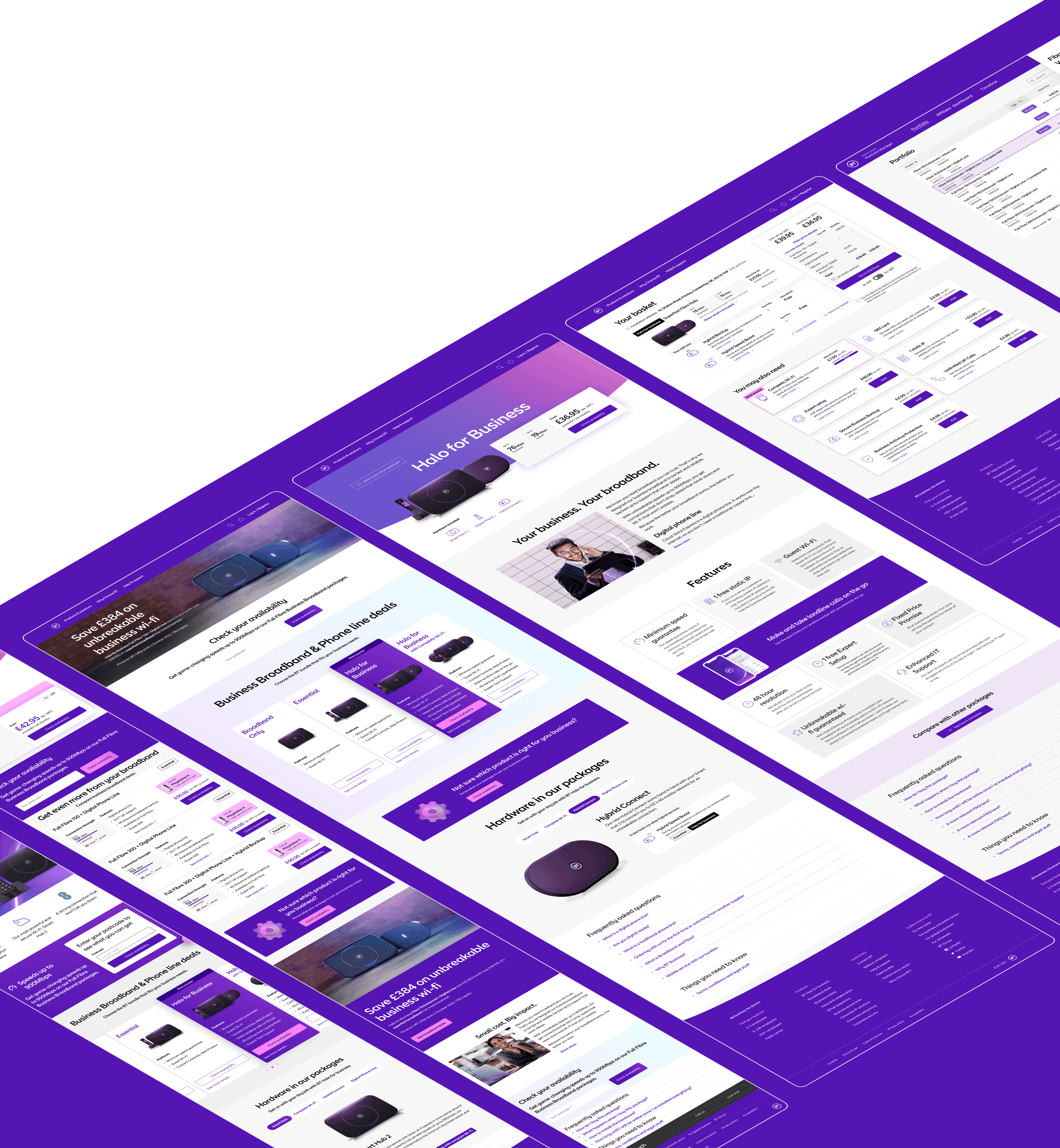
BT's business product pages, with the research time argued for up front as a two-sprint buffer before development
- Years
- 2022-2023
- Role & team
- Senior Visual Designer
- 2 Designers, Content Strategist, Development Team
- Activities
- User Research, Concept Creation, Visual Design, Usability Testing
Reading time: 1 min
01 · About
A clarity problem that showed up as missed sales
British Telecom's business website had a clarity problem, and it showed up as money: a loaded call center and missed sales. There were no clear requirements, so we had to define the project scope ourselves, inside BT's brand framework.
I was the senior visual designer on the project. We worked as a pair of designers, alongside a content strategist and BT's development team.
02 · Discovery
The journey from learning to purchasing was disjointed
We started with in-depth user interviews and went through the call center data to find where people actually got stuck:
- Information Overload: users overwhelmed by technical jargon.
- Unclear Pathways: disjointed journey from learning to purchasing.
- Support Dependency: frequent reliance on call center assistance.
03 · Process
From requirements to guidelines in five steps
- Requirements gathering
- In-depth user interviews
- Ideation: wireframes / prototype creation
- Usability testing
- Results analysis / prioritisation
- UI delivery + guidelines
- Contribution to the Design Library
04 · Design approach
A two-sprint buffer bought room to test concepts
The two of us argued for a Design Foundation Approach: a two-sprint buffer before development. That buffer is what bought the time for real research and for testing several concepts instead of shipping the first one.
05 · Solution
Value propositions first, jargon out
Reimagined Product Pages and Product Carousel
- Clear value propositions at the top
- Highlighted key differentiators between products
- Simplified technical specifications
- Prominent calls-to-action
- Improved mobile responsiveness
Enhanced User Journey
- Reduced steps to find relevant information and complete the purchase
- Contextual recommendations
- Simplified product configurators
- Clear pricing at each step
06 · Impact and results
Conversion up three points, click-through up one
20% → 23%
Conversion Rate
5.5% → 6.5%
User Engagement (CTR)
07 · Conclusion
Clearer paths to buy, more completed purchases
The redesigned pages put the value proposition, the differences between products, and the price in front of people before they had to go looking. The numbers above are the result: more people clicked through, and more of them completed the purchase.
Building cloud infrastructure discovery tool