Bausch + Lomb
Redesigning Eyetelligence around the surgeon's day
A workflow-first surgical planning platform, redesigned end to end in ten weeks
- Period
- Aug to Dec 2025
- Scope
- End-to-end UX redesign + design system
- Role & team
- Lead designer, owned all design
- Design Director, Marketing Team (Customer), Developers
- Activities
- User Interviews, On-site Observation, Heuristic Evaluation, Design System, Prototyping, Usability Testing
Reading time: 5 min
01 · Overview
Ten weeks from a database-shaped tool to the surgeon's day
Eyetelligence is Bausch + Lomb's platform for cataract surgical planning. Surgeons use it to calculate intraocular lenses (IOLs), build surgical plans, and coordinate with their teams, with diagnostic data flowing in from devices such as SeeNa. In ten weeks we took it from a database-shaped tool to a product organized around the surgeon's working day, and handed it to development.
We delivered this for Bausch + Lomb through EPAM. The design work on the project is mine: the information architecture, every flow and screen, the prototypes, and the design system underneath them. Our design director ran the client relationship, estimations, and project planning, and joined the research sessions. On the Bausch + Lomb side we worked with the product and marketing teams.
02 · Challenges
No room for guessing, and no touching the backend
- Ten weeks from discovery to developer handoff.
- A steep learning curve: cataract surgery workflows and IOL calculations leave no room for guessing.
- A marketing team that defended the existing product and pushed back on change.
- The front end had to improve without touching the backend architecture or clinical accuracy.
03 · Discovery, weeks 1-3
The interface mirrored the database, not anyone's day
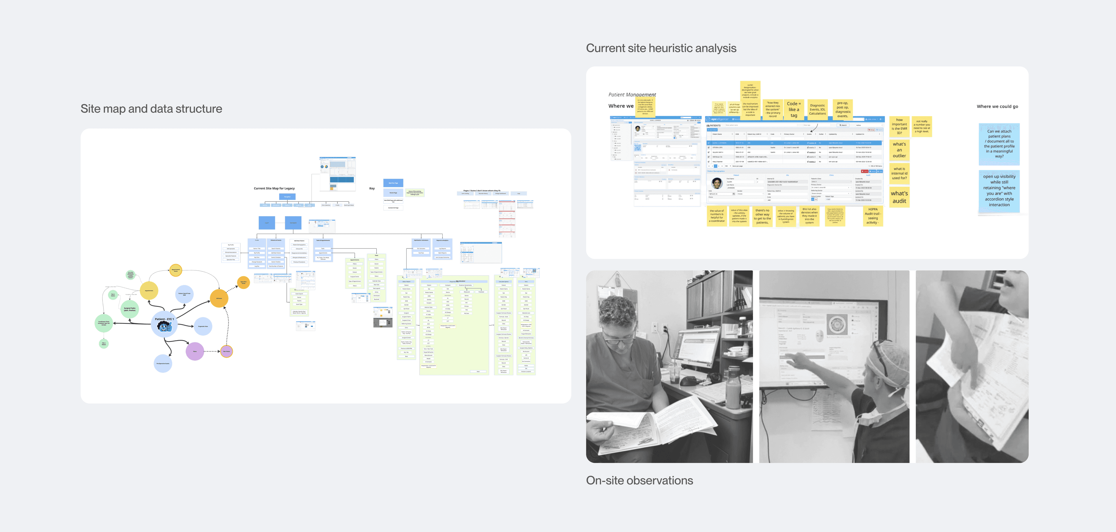
We inherited a thick research archive from a prior consultant team, and I synthesized it. We ran stakeholder alignment sessions, interviewed users on the ground, and I went on site to watch surgeons and coordinators work. A heuristic pass over the existing product explained the complaints we kept hearing.
6
Users interviewed (4 surgeons, 2 coordinators)
Design direction
Build the product around roles and tasks
Users navigated tables of records instead of their own day. That finding set the direction for everything that followed: the dashboards, the tasks, and the calculator all start from the user's day.
- Research synthesis: turned the inherited materials and alignment sessions into working design principles.
- System analysis: site maps, documented workflows, and a heuristic review of the existing IA.
- Field research: on-site clinic observations with surgeons and coordinators.
04 · Design principles
Five principles, all pointing at the day's work
- Jump straight into work. Surgeons wanted the day's planning workload first, not an analytics dashboard.
- Optimize planning, not the EMR. The product should excel at surgical calculations instead of duplicating patient management tools.
- Notes travel with patients. Decisions and case flags hand off cleanly between coordinators and surgeons.
- Save progress, show readiness. Draft states and a clear surgical prep status prevent lost work and confusion.
- Team visibility. Each role sees the other's task completion, which prevents duplicate work.
05 · Design and testing, weeks 4-6
Testing settled the two loudest arguments
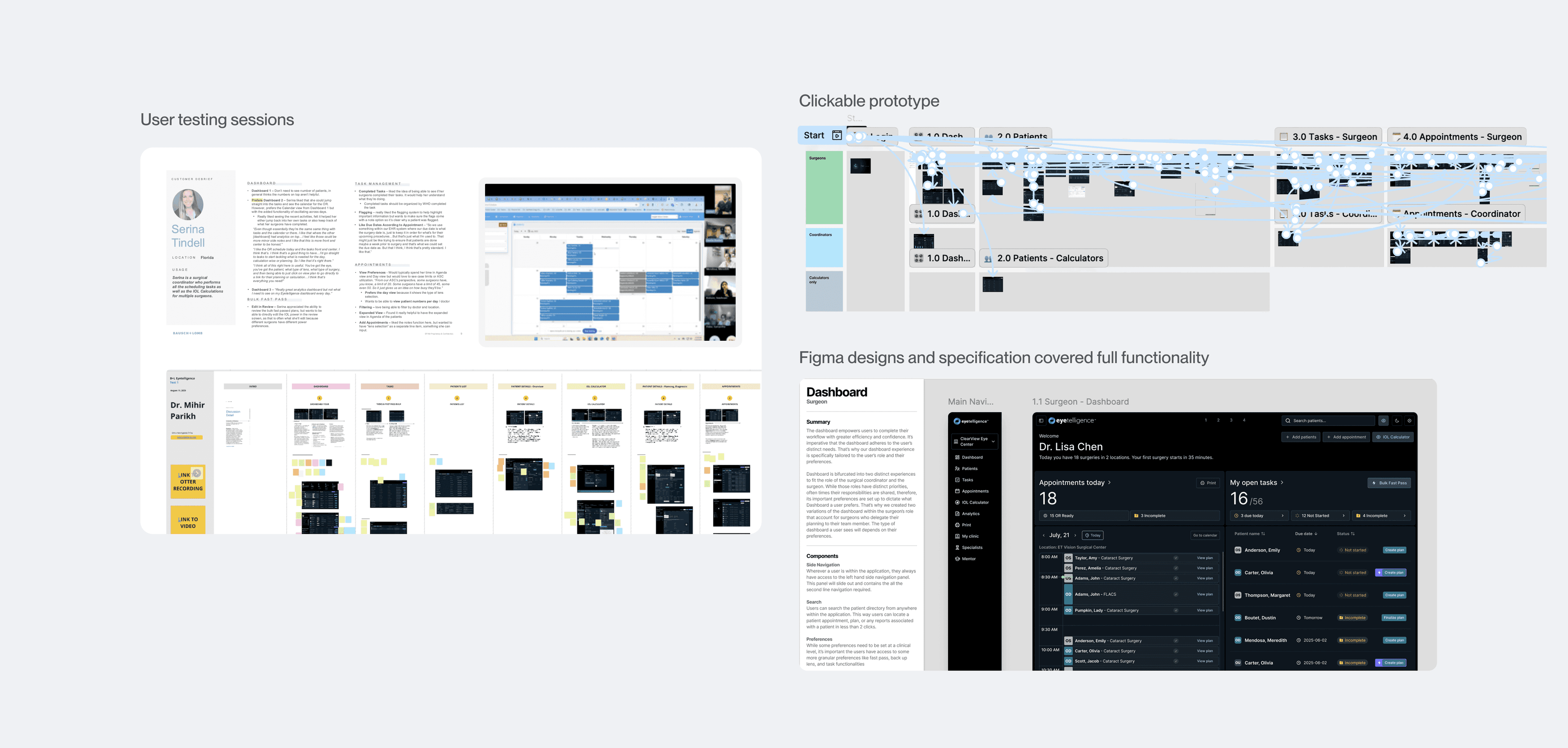
With the system in place I built interactive, multi-themed prototypes and we ran scripted remote usability sessions, alongside feasibility work and sprint planning with the development team.
10
Usability sessions (6 surgeons, 4 coordinators)
Two Hard Arguments
Two of the loudest disagreements with the marketing team were settled in testing, both by evidence rather than by opinion.
The default theme
The marketing team was certain the light theme should be the default. Then we tested. Every clinician chose the dark theme, because exam rooms and ORs are kept dim and a bright screen is a problem there. The system's theming support stopped being a nice extra and became a clinical requirement.
The calculator
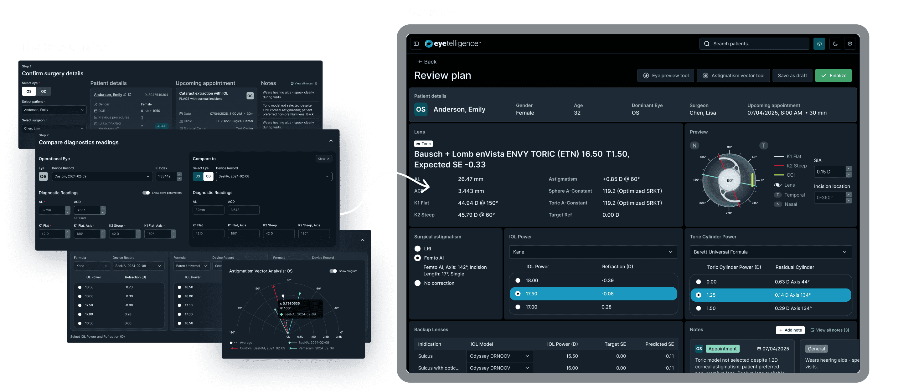
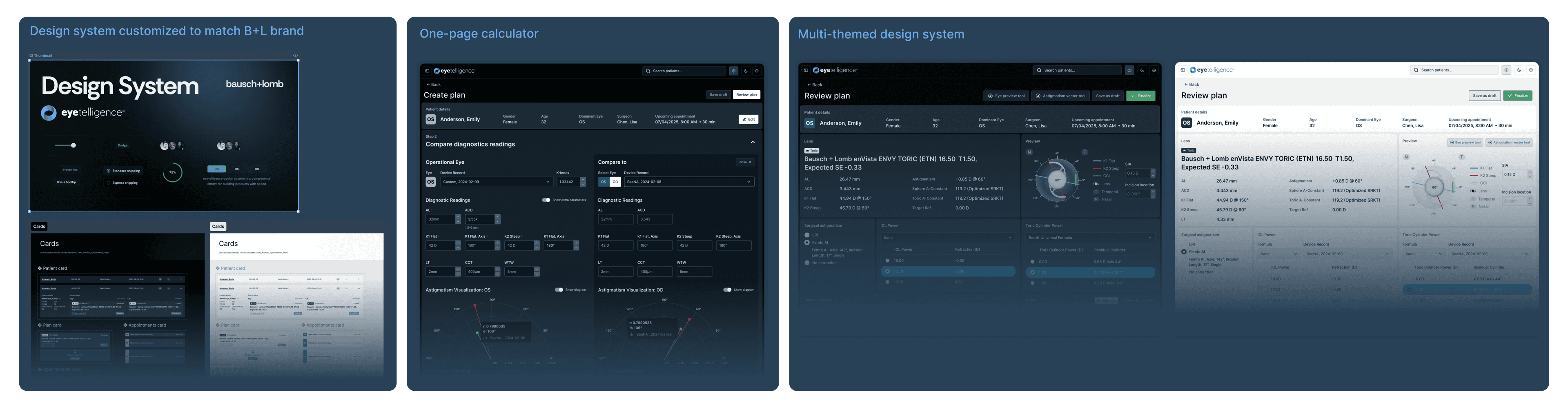
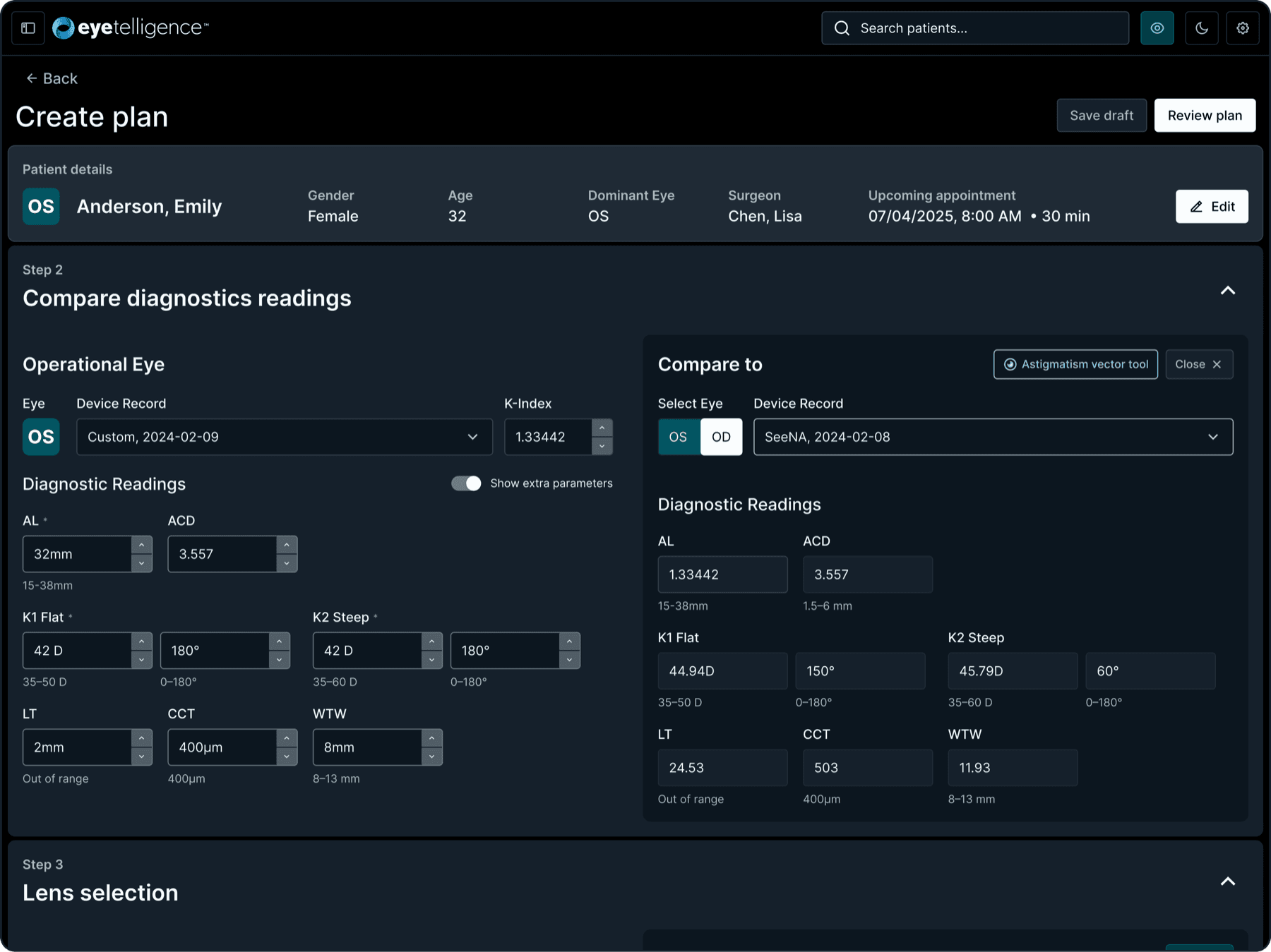
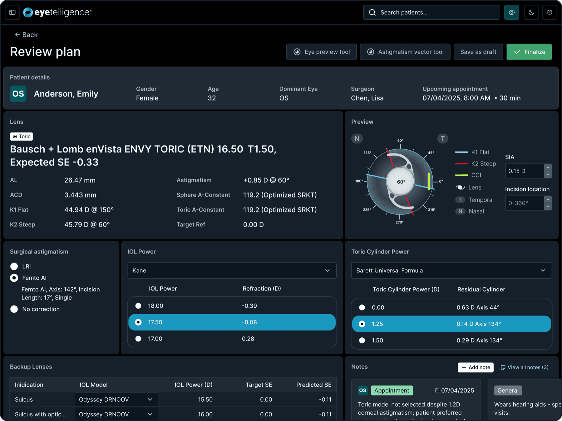
The IOL calculator changed more than anything else in the product: a five-page flow collapsed to two, built around one long calculation view where every change recalculates in place, then a confirmation step. Marketing resisted this hardest. The mental model was different, the order of actions had changed, and they argued the long screen would be inconvenient and wanted a step-by-step wizard instead. Surgeons in testing came down firmly on the side of the long view: they could finally see the whole calculation and how each change moved the result.
User interviews, weeks 1-3
6
Usability sessions, weeks 4-6
10
06 · Design system
One designer, a full product's worth of screens in ten weeks
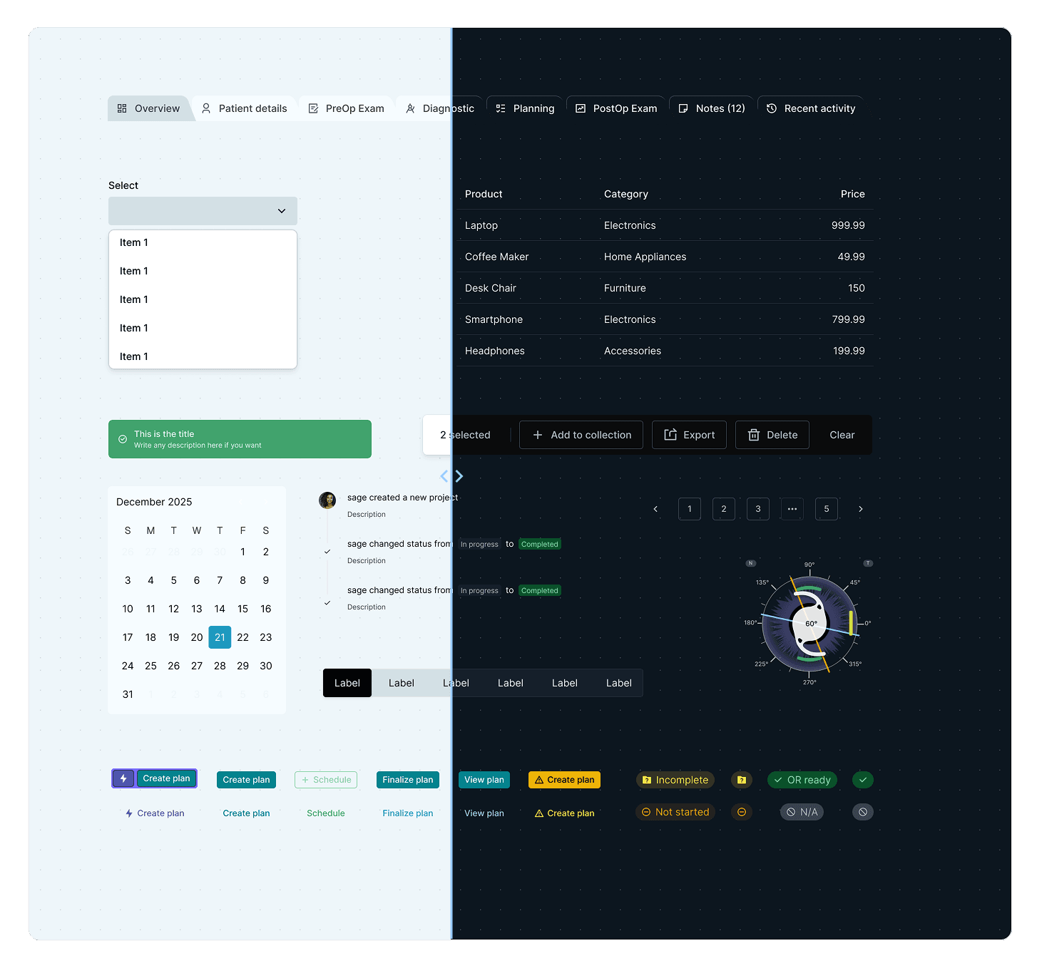
The timeline only worked because of the system underneath it. Instead of drawing components from zero, I set up a production component kit and customized it into the Eyetelligence system: tokens, light and dark themes, and a library organized one page per component. Each page is a full specification sheet, with the component's states and sizes, a live demo, and links to the docs the development side works from. It is the reason one designer could produce a full product's worth of screens in ten weeks and keep them coherent.
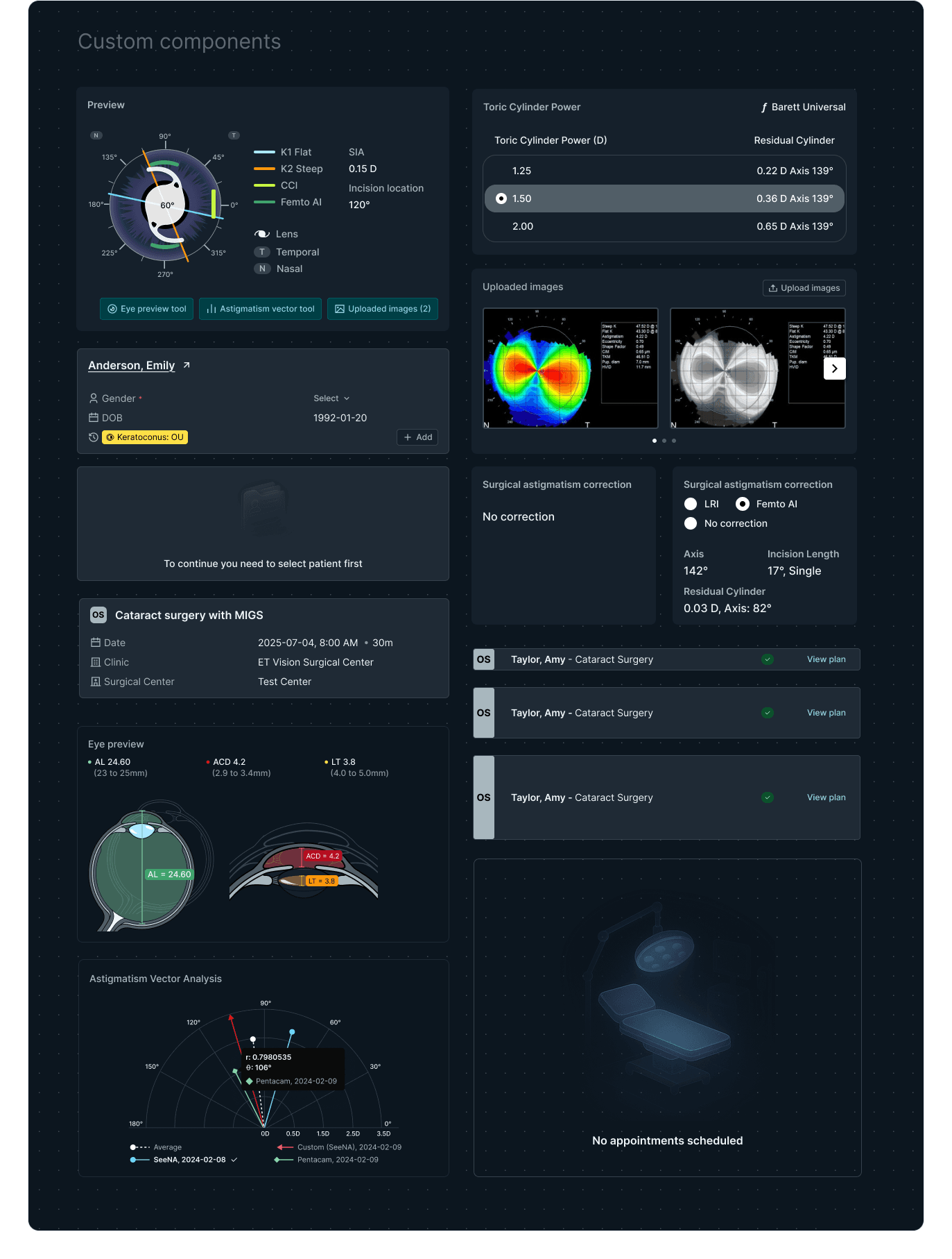
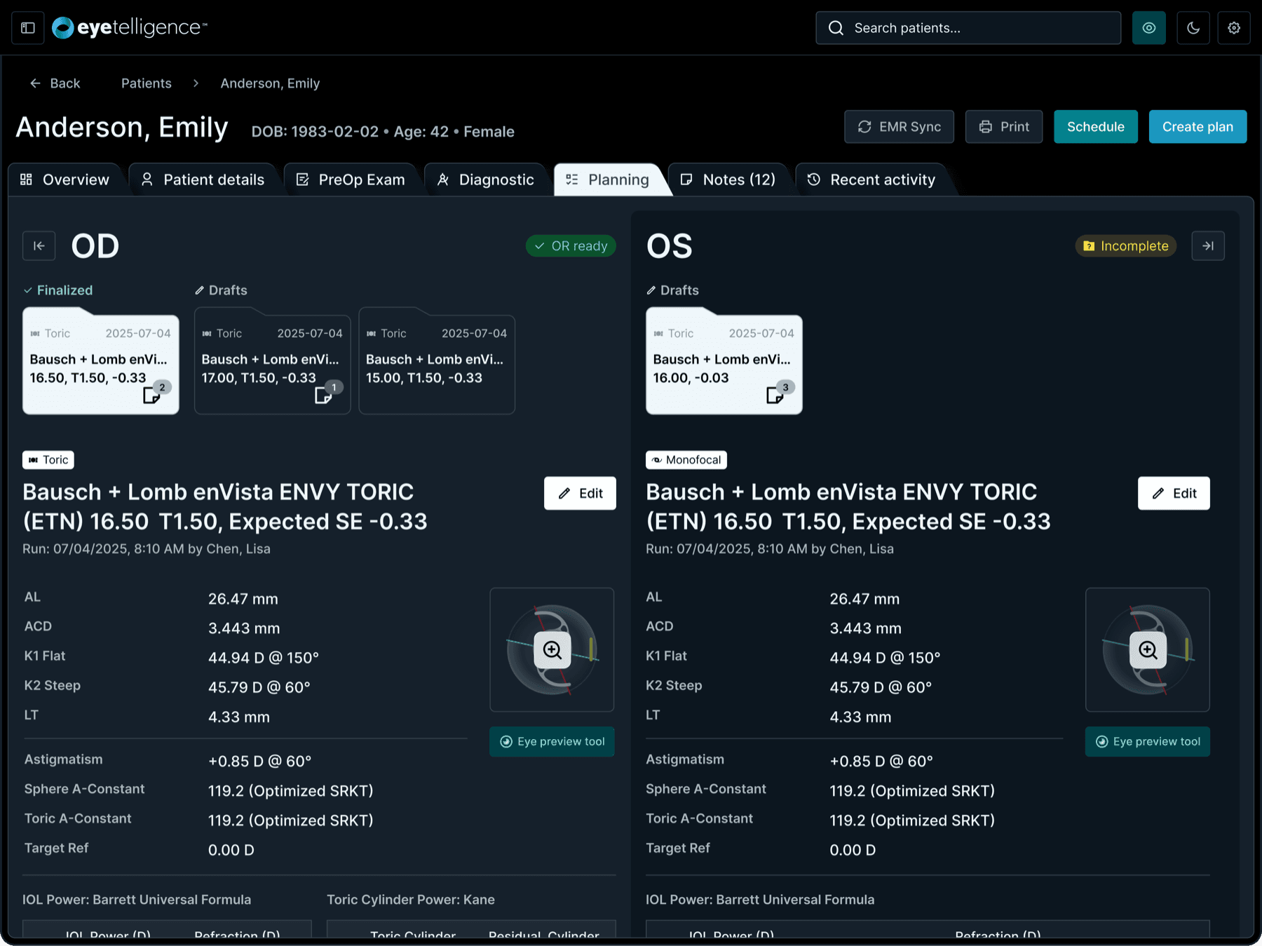
The harder half was the components a general kit has no answer for: the ones a surgical planning tool needs to hold up against real operating-room workflows. I designed those into the same system, so clinical work was covered by the design system, not bolted on beside it: the eye preview, astigmatism vector analysis, toric cylinder power selection, diagnostic image galleries, and the surgery and appointment cards.
07 · Key innovations
The day's work first, the database second
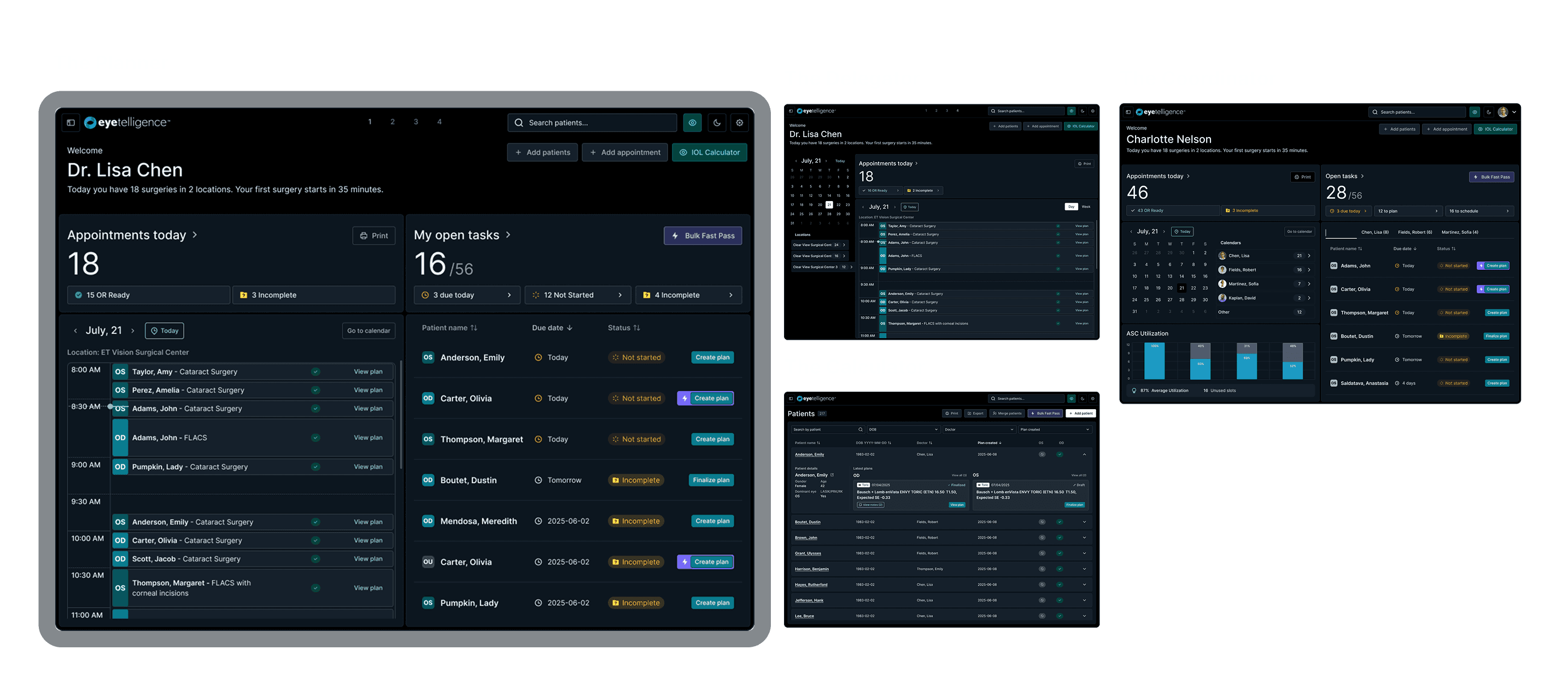
Dashboard personalization
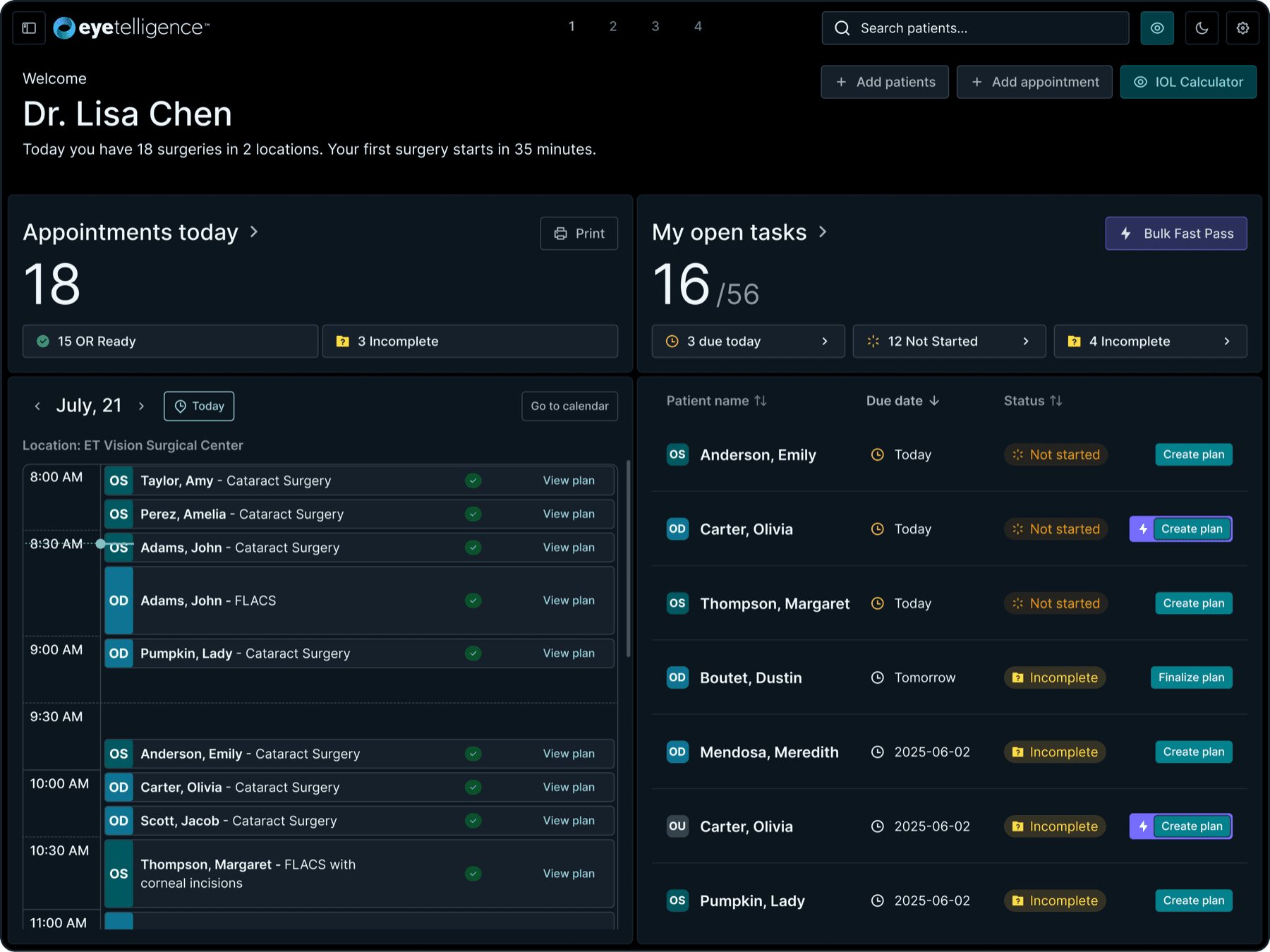
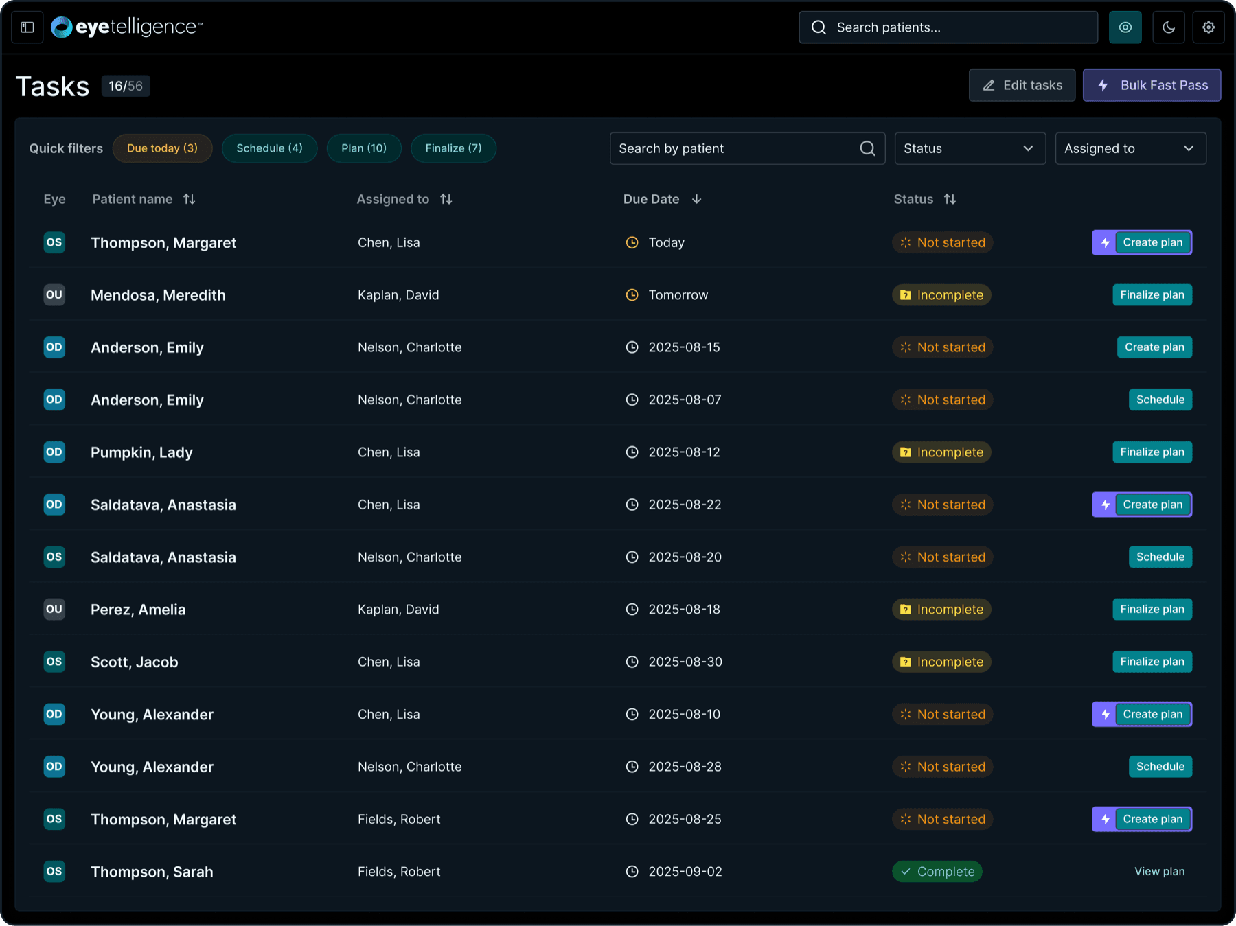
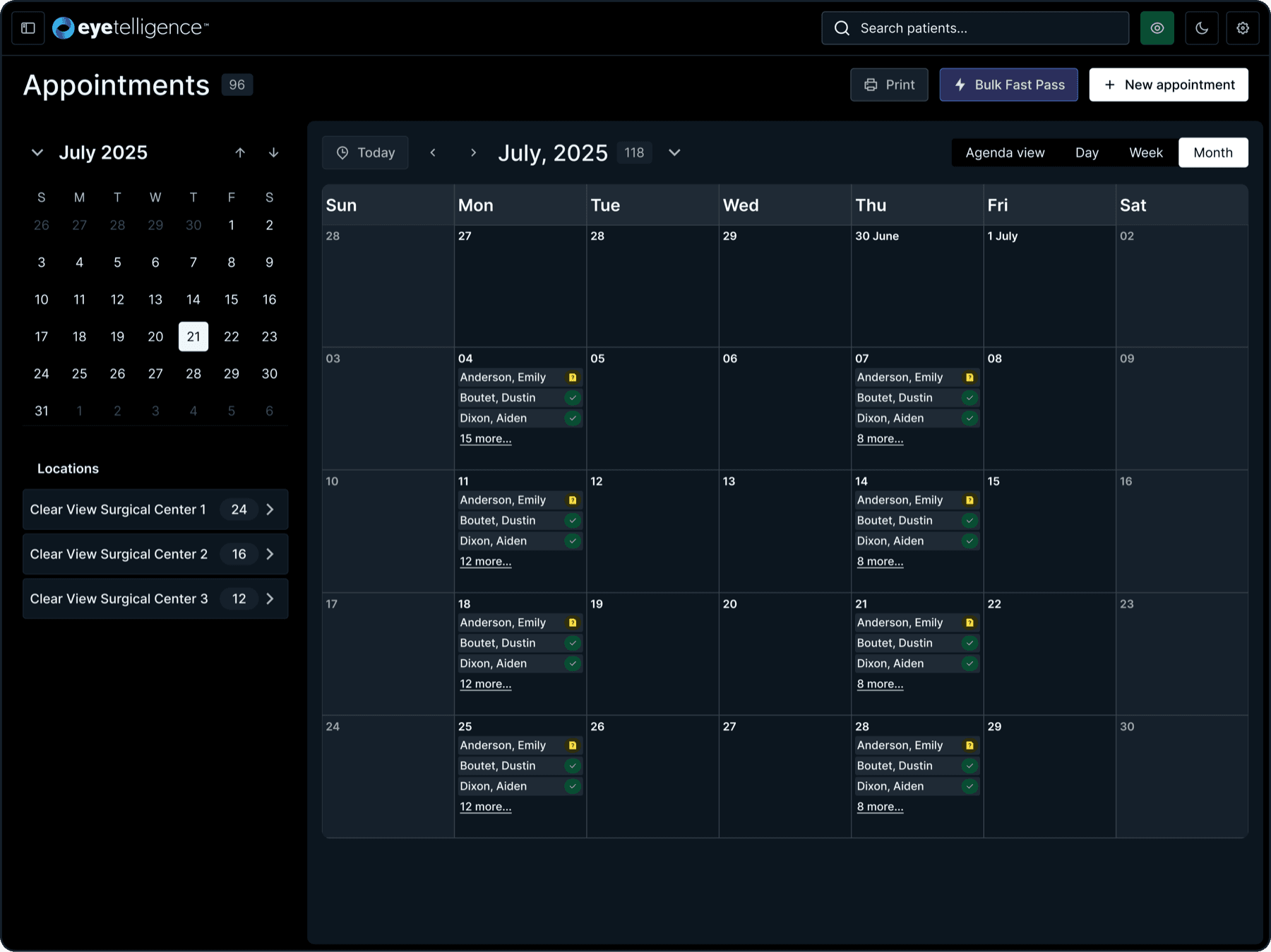
I put the day's work first: surgeons get personal task lists and day views with quick access to OR-ready plans, and coordinators get month views with multi-surgeon task management and practice metrics. Both come straight out of the discovery finding that people wanted their day on screen, not a database.
Streamlined calculations
The calculator is one continuous view. Change an input and the formulas update in place, so surgeons can compare options without paging back and forth. This is the screen the marketing team wanted split into a wizard, and the one surgeons defended in testing.
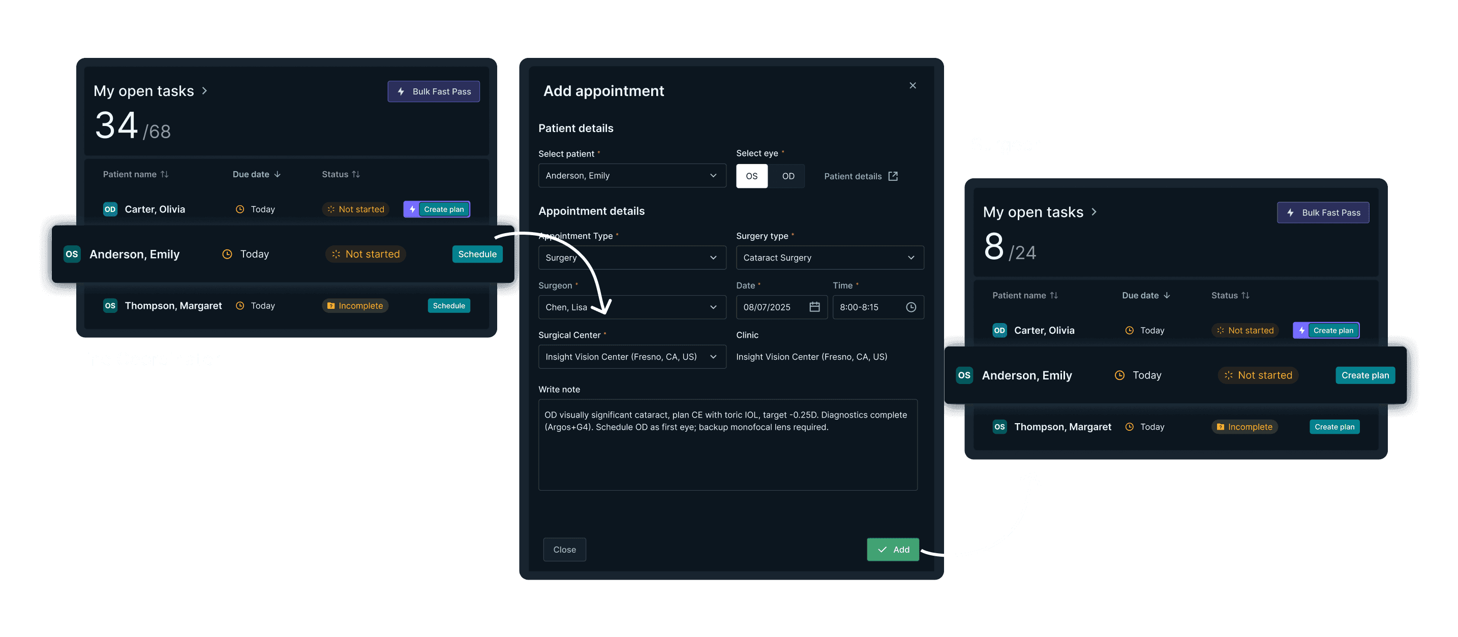
Facilitated connections
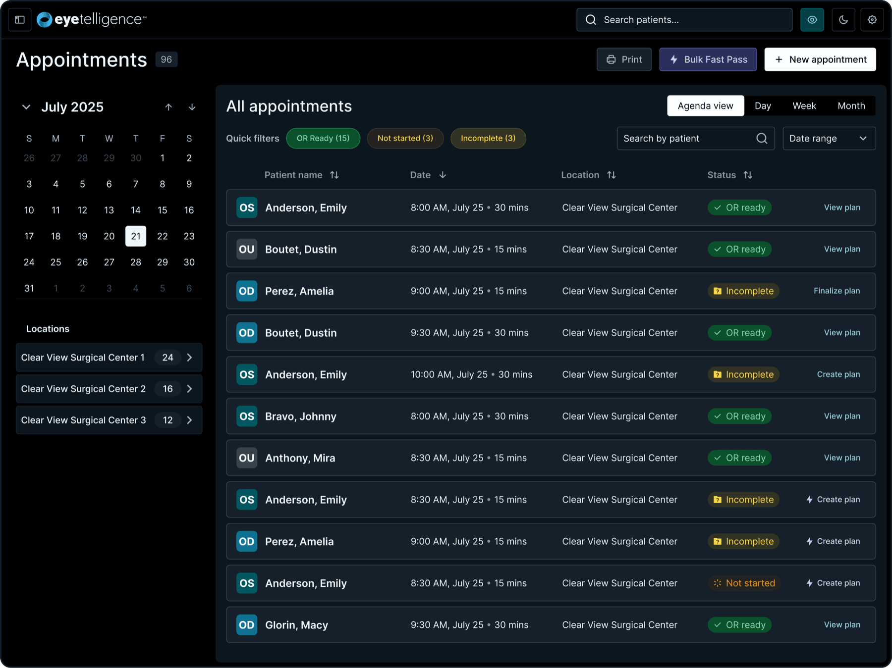
Tasks carry the work between surgeons and their staff. Scheduling an appointment creates the related planning tasks automatically, so handoffs stop depending on someone remembering to ask.
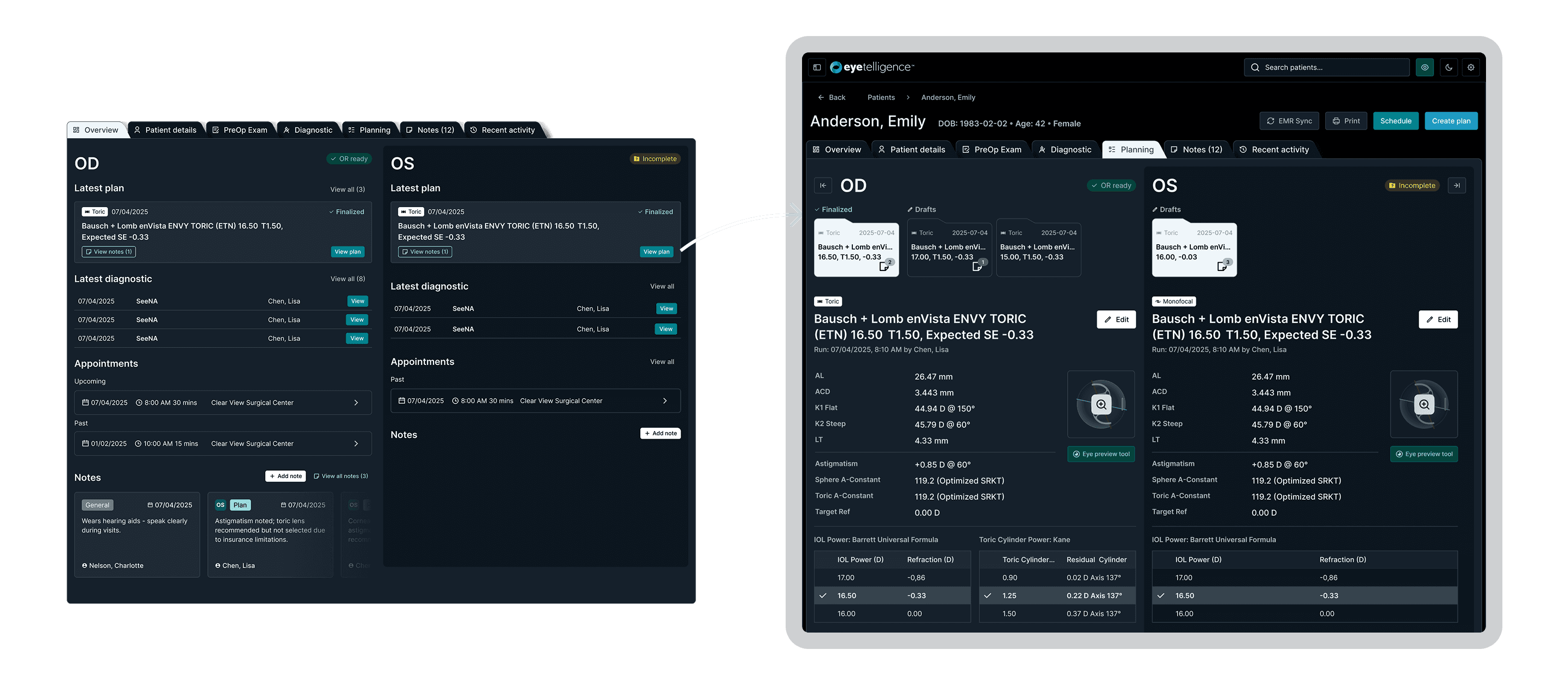
Planning-first patient management
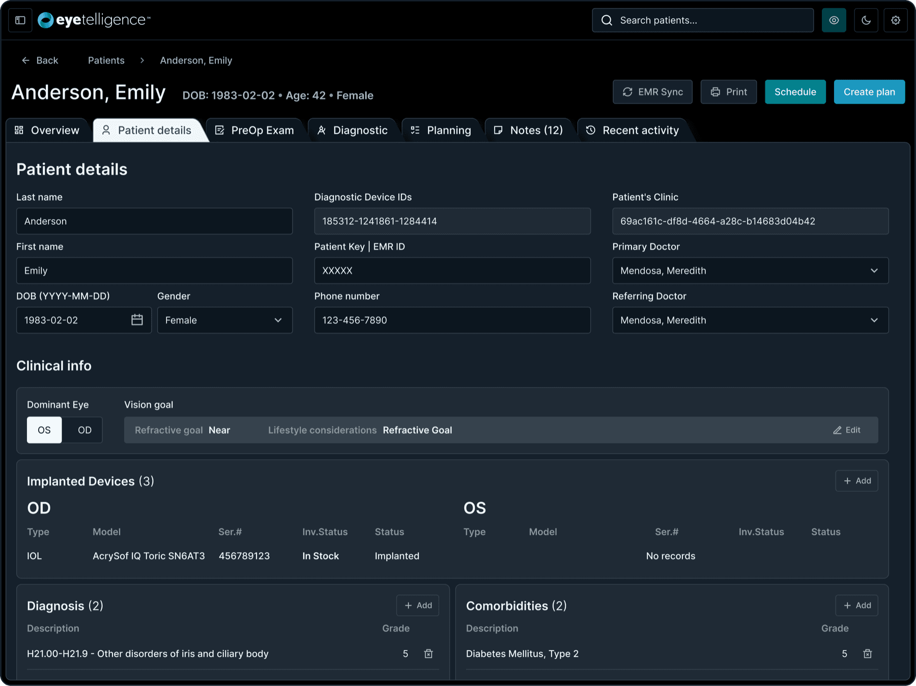
Patient records exist here to serve planning, not to replace an EMR. Surgeons and coordinators track calculations and compare plans without wading through general-purpose record keeping.
08 · Refinement and handoff, weeks 7-10
A full-functionality prototype, and everything needed to build it
The last stretch of the ten-week sprint turned the validated concepts into a prototype covering the product's full functionality, plus everything needed to build it: documented component variants, interaction patterns, and final specifications. From there I stayed with the project through the end of the year, supporting the development team and designing the remaining use cases as they surfaced in the build.
09 · Results
68% fewer clicks across core planning tasks
Where in the prior version it didn't really do much for me on the dashboard as far as giving me actual data... I think this is definitely an improvement. It actually gives me data.
Dr. Shumway
Surgeon · usability sessions
I like the OR schedule today and the tasks front and center. I think that's a good thing to have... I'd go straight to tasks to start tackling what is needed for the day.
Coordinator Serina
Coordinator · usability sessions
01
IOL calculator
Five pages became two: a long calculation view plus a confirmation step, with formulas that update in place instead of a round trip for every change.
02
Fast Pass
A new batch-planning flow. It preps multiple patients in as few as three clicks, with quality checks along the way.
03
Dashboard
Priority tasks sit on the first screen, so urgent work no longer hides in sub-sections.
68%
fewer clicks across core planning tasks, counted on the old flows versus the new ones
10 · Impact
A workflow tool now, not a calculator with a database attached
The redesign repositions Eyetelligence as a workflow tool rather than a calculator with a database attached, which is also what separates it from competitors. The two decisions the client argued hardest against, the dark default and the single-view calculator, were settled by surgeons in testing rather than in the review room, and development took the design system and the specifications straight into the build.
The shipped product
Designing across 15 legal and tax product teams