
Sensirion
Making an invisible pollutant readable on any screen
Sensirion asked for one icon for volatile organic compounds; the work became a research project and a 120-page framework
- Years
- November - January 2023
- Domains
- Air quality monitoring
- Team
- 1 Researcher, 2 Designers
- Activities
- Market Research, User Research, Visual Design, Usability Testing, Guidelines Development
Reading time: 2 min
01 · About
About
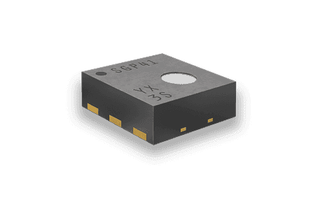
Sensirion, a leading manufacturer of environmental sensors, approached the team with what seemed like a straightforward request: create an icon for Volatile Organic Compounds (VOC) and develop guidelines for air quality monitor producers.
The real challenge ran deeper: VOC data is complex and unfamiliar to most users, and needed to be displayed on devices with varying screen sizes and technical limitations. Sensirion's sensors also primarily show relative data (changes in contamination levels) rather than absolute values, adding another layer of complexity.
02 · Process
From alignment to prototyping in five stages
- Alignment: business goals study, project roadmap definition, research methods definition
- Learning: niche research, trend research, market research
- Analysis: user research, use cases definition, visual research, recommendations
- Ideation & Envisioning: hypothesis mapping, ideation sessions, brainstorming, ideas refinement
- Design & Prototyping: design concepts, prototyping
- Evaluation: user testing, feedback gathering, design update
03 · Discovery, the reframing
An icon request became a research project
Original Request
- Create an icon for VOC
- Develop basic guidelines for AQ monitor producers
Expanded Scope
- Research VOC sensor visualization and user needs
- Provide guidance on data visualization: icons, colors, and micro-interactions
- Create visualization concepts for low-resolution screens
- Develop a holistic design approach for air quality data
Outcome: the team transformed the initial request into a comprehensive research project.
04 · Research
Four personas and a device audit before any visualization
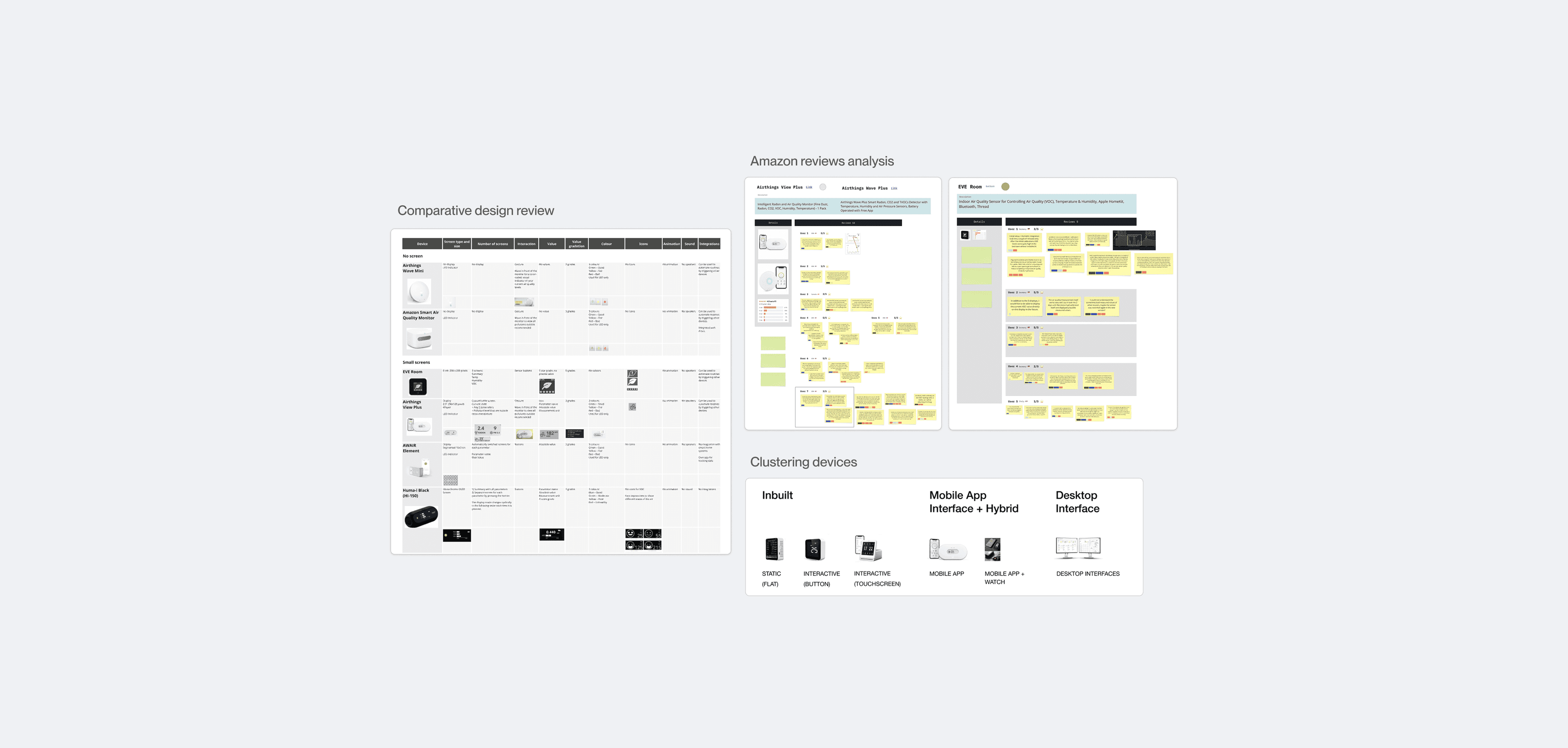
Niche Research
- Analyzed popular air quality monitors
- Clustered devices by screen size and capabilities
- Identified technical constraints across device types
Trend and Market Research
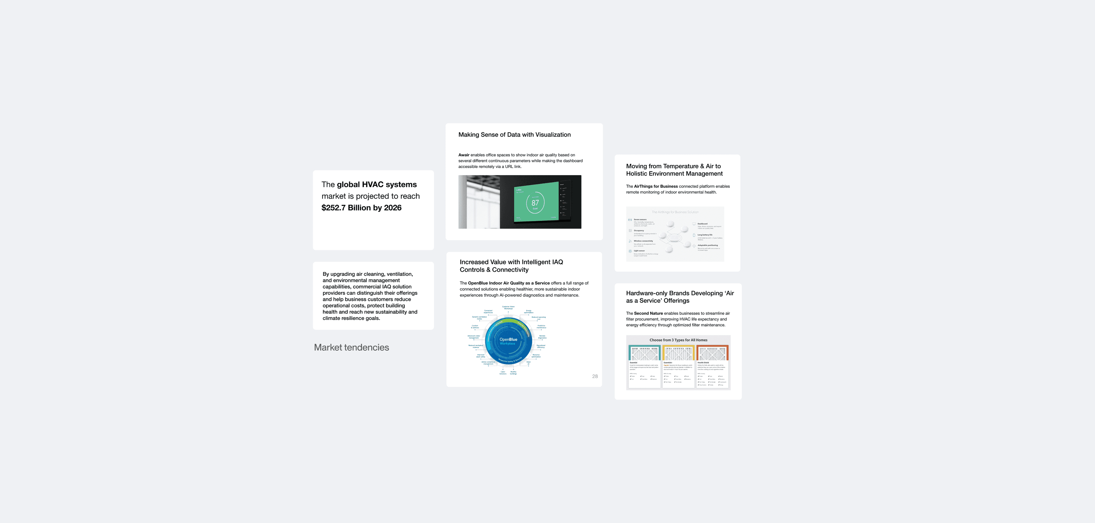
- Examined leading solutions for interaction patterns
- Analyzed value display conventions
- Studied scale representations, color usage, iconography, and sound indicators
- Conducted desk research on market trends
- Analyzed competitor approaches to air quality visualization
- Identified gaps in current visualization methods
User Research
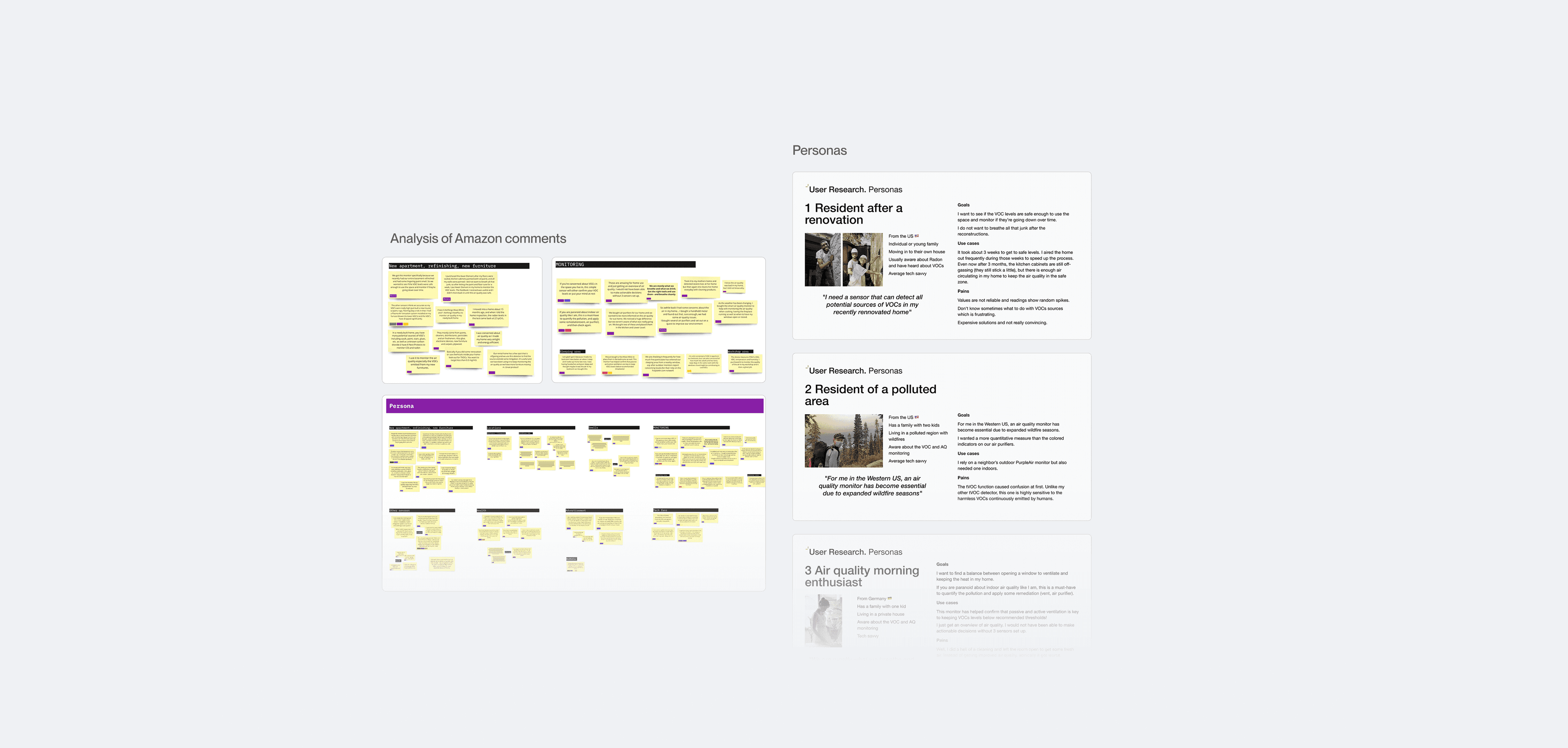
- Defined key use cases and scenarios
- Identified user mental models regarding air quality
- Understood user expectations for air quality indicators
4
User personas
05 · Key insights
Nobody knows what VOC means
- VOC Unfamiliarity: users had limited understanding of what VOC means, making any icon solution inherently difficult to recognize without education.
- Relative vs. Absolute: Sensirion sensors primarily show relative data, not absolute values, creating challenges for straightforward visualization.
- Device Diversity: air quality monitors range from simple LED indicators to full-color displays, requiring flexible visualization approaches.
- Context Matters: users need context to interpret air quality data meaningfully; a number or color alone isn't sufficient.
06 · Visual research
How to color an invisible phenomenon
Conducted visual research on existing VOC data visualization approaches for color coding, iconography, and data visualization, identifying best practices and proposing more effective visual solutions.
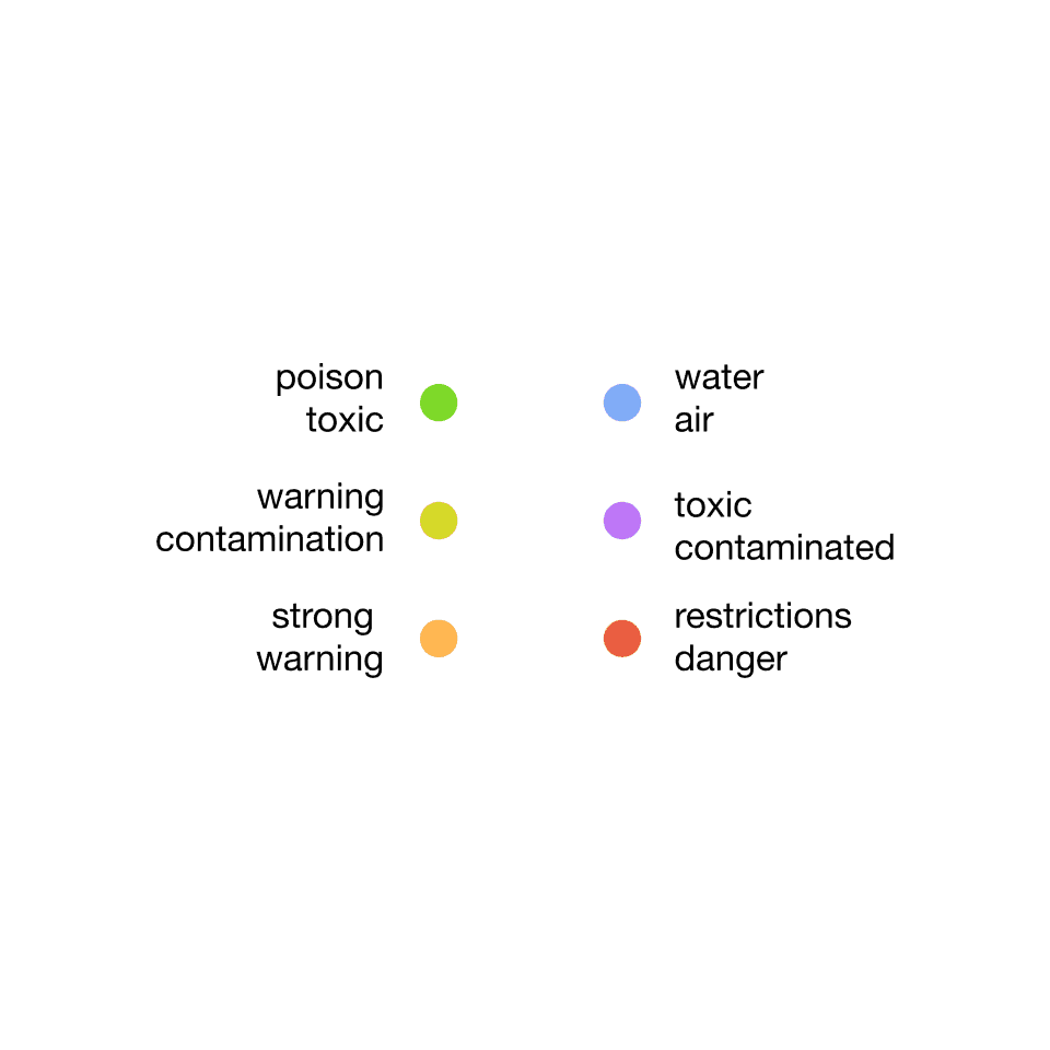
Color coding
- Analyzed existing color schemes
- Studied color perception across contexts
- Developed recommendations for accessible color usage
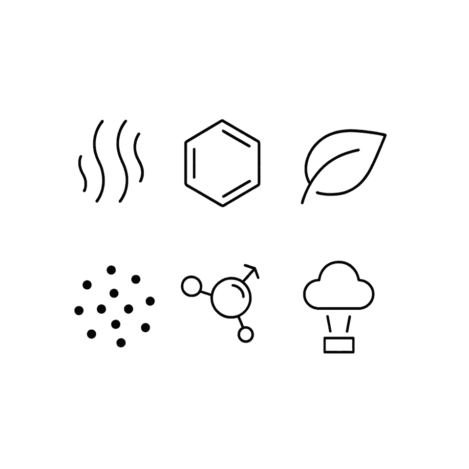
Iconography
- Evaluated existing visual solutions for invisible phenomena
- Created variations of VOC icons based on different metaphors
- Tested recognition and understanding with users
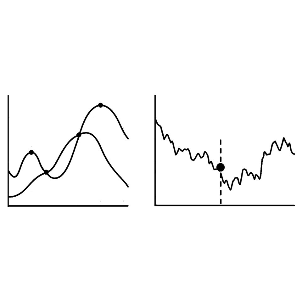
Data visualization
- Developed concepts for displaying relative and absolute values
- Created multiple visualization options for different screen sizes
- Tested comprehension and preference with users
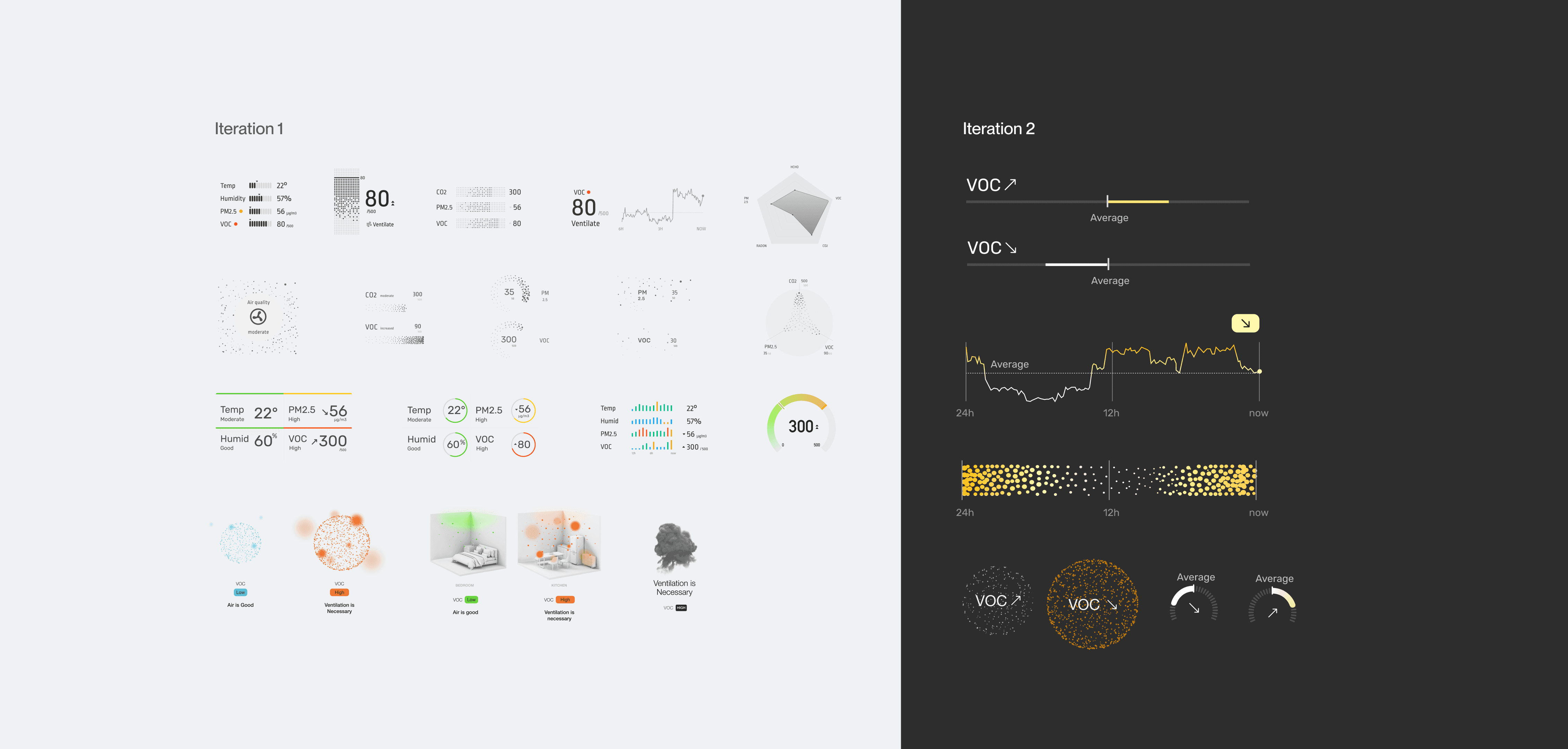
07 · Concept ideation
Every concept on the table, and 'Air is Good' won
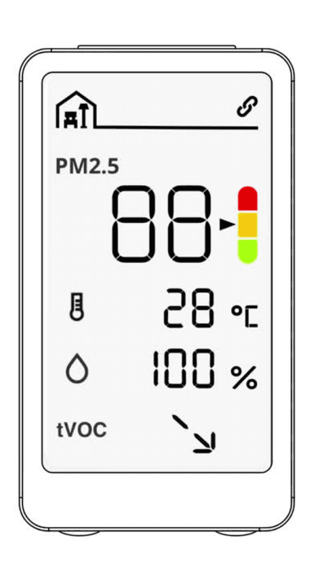
After brainstorming sessions, iterated on all possible VOC visualization concepts, then chose and tested the best concepts with users, landing on "Air is Good."
01
Research findings
02
Ideation
Voting
03
Moderated user testing
Feedback analysis
04
Concept improvements
Voting
05
Unmoderated user testing
Feedback analysis
08 · User testing
10 moderated sessions, then 52 respondents at scale
 Moderated study
10
Sessions
 Unmoderated study
62%
52
Respondents
Never thought about the VOC level in their homes.
09 · Solution
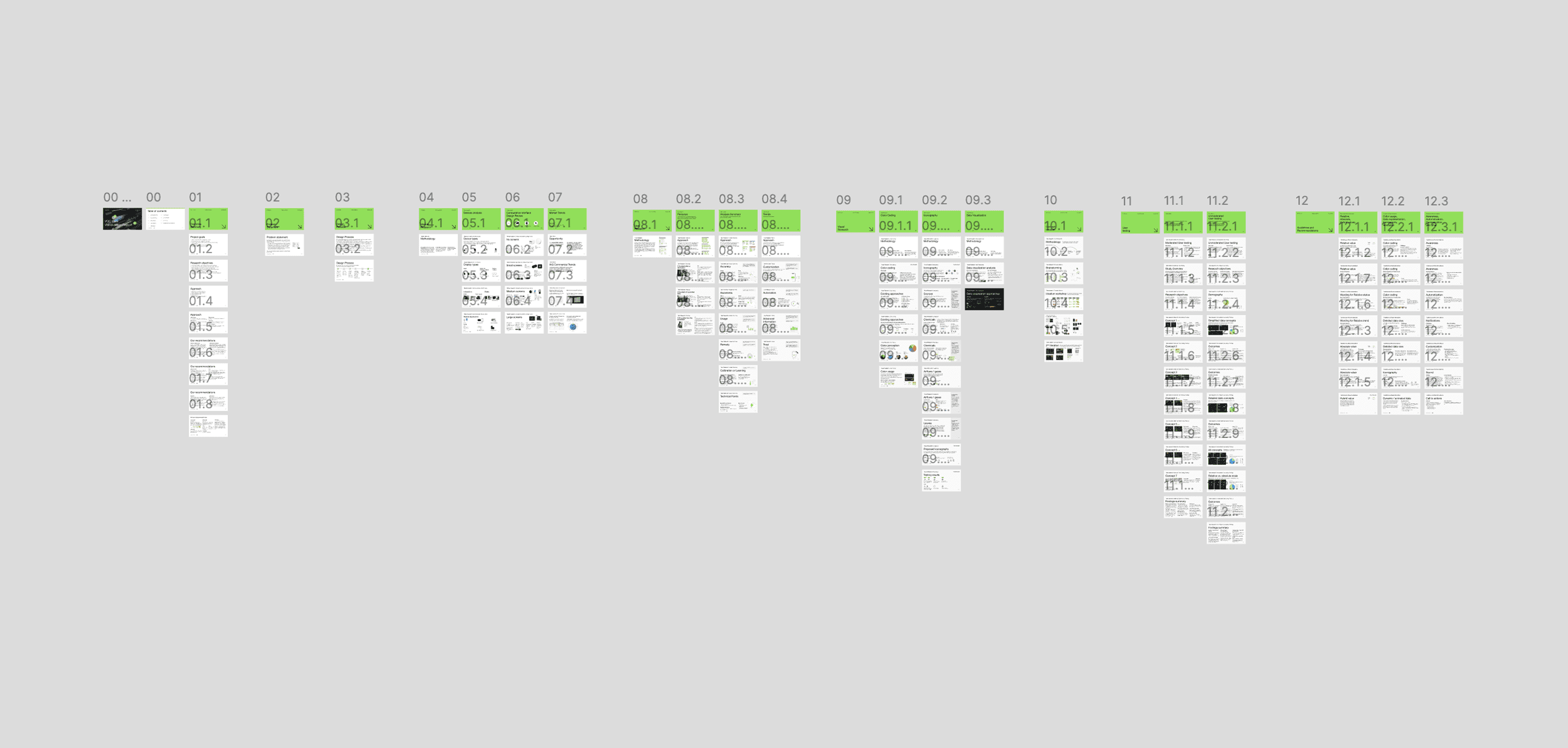
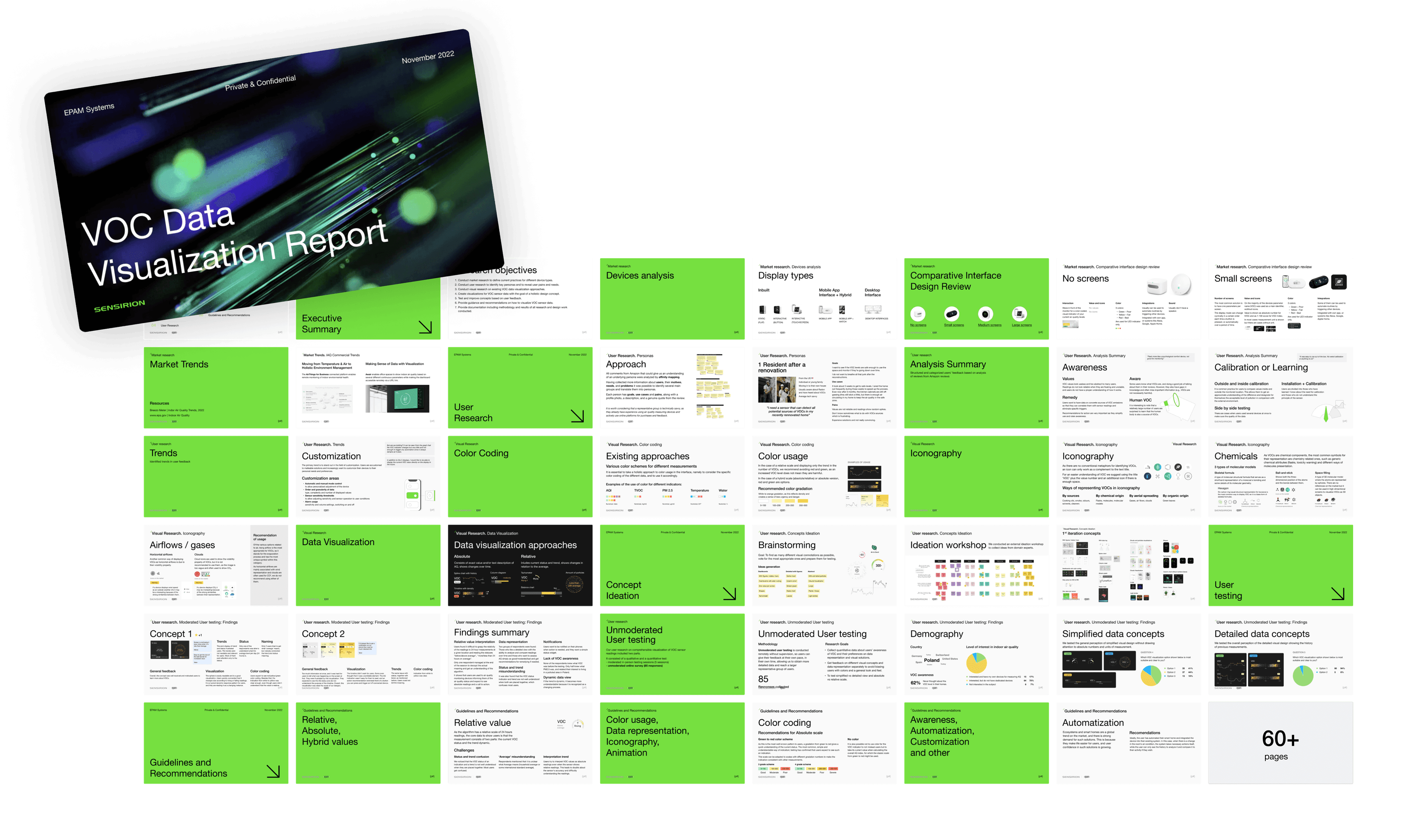
Not an icon: a 120-page framework
Rather than delivering a single icon as initially requested, the team created a comprehensive 120-page report with guidelines and recommendations covering:
- Data Visualization Framework
- Iconography System
- Color Usage Guidelines
- Interaction Patterns
10 · Impact and results
From tactical icon design to strategic UX
- Problem Identification: helped Sensirion understand the true complexity of VOC visualization and brought these insights to stakeholders.
- Hypothesis Validation: validated key hypotheses about user understanding and visualization preferences.
- Actionable Recommendations: provided a fully actionable plan with specific implementation guidelines.
- Strategic Value: elevated the conversation from tactical icon design to strategic UX considerations.
11 · Conclusion
The true challenge was representing complex air data
What began as a simple request for an icon evolved into comprehensive research that addressed the true challenges of representing complex air quality data, delivering lasting value to Sensirion and their hardware partners.
Building cloud infrastructure discovery tool