
Wallarm
Building cloud infrastructure discovery tool
A six-week build of Wallarm's infrastructure discovery tool, designed and shipped in code.
- Timeline
- May to June 2026
- Product
- Infrastructure Discovery
- Role
- Senior Product Designer
Reading time: 4 min
TL;DR
I owned Infrastructure Discovery at Wallarm, from a raw concept to a feature live with enterprise customers. It maps a company's cloud assets and shows security engineers what is exposed and what to fix first. The concept I inherited used a physics layout that scattered every asset with equal weight. I replaced it with a fixed, severity-first view, designed it against real data, and merged the UI into the product myself. We showed it at AWS Summit.
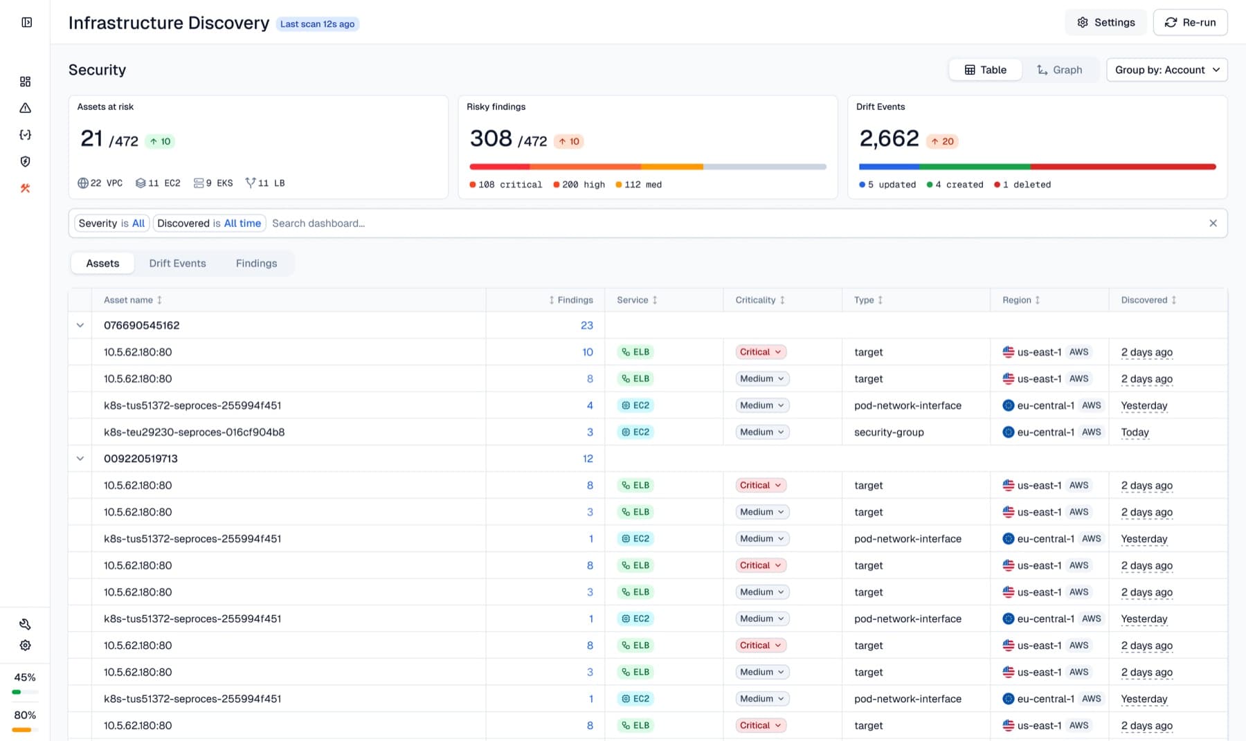
01 · State 1, the inherited graph
Impressive on a demo account, unreadable on a real one
The centerpiece was an interactive topology graph. It looked impressive on a demo account and collapsed into an unreadable hairball on a real one, where a critical internet-exposed asset looked the same as a benign one. A security team needs to know where it is exposed and what to fix first, and the graph could not say.
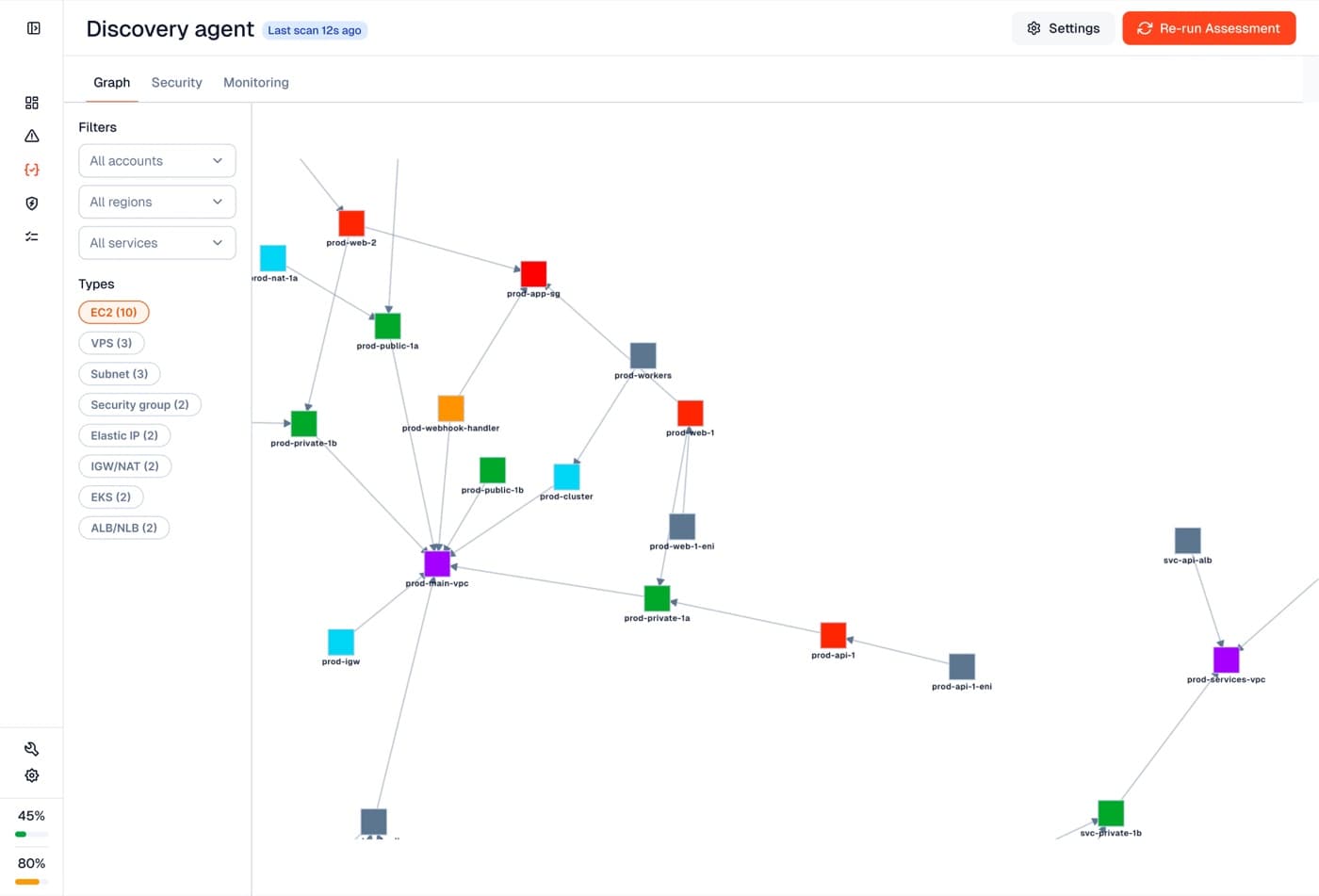
It was also read-only, with only structural data collected, so risk had to be inferred from configuration, not content.
02 · The reframe
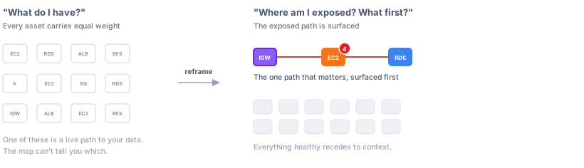
Security engineers open the tool to find the one exposed path
Eight interviews with security engineers said the same thing: they don't open the tool to admire a map, they open it to find the one exposed path that matters. That split the work in two: a redesign to ship now, and an attack-path concept to pitch.
8
Interviews with security engineers, all pointing at the same split
The same estate, before and after
03 · Prioritization
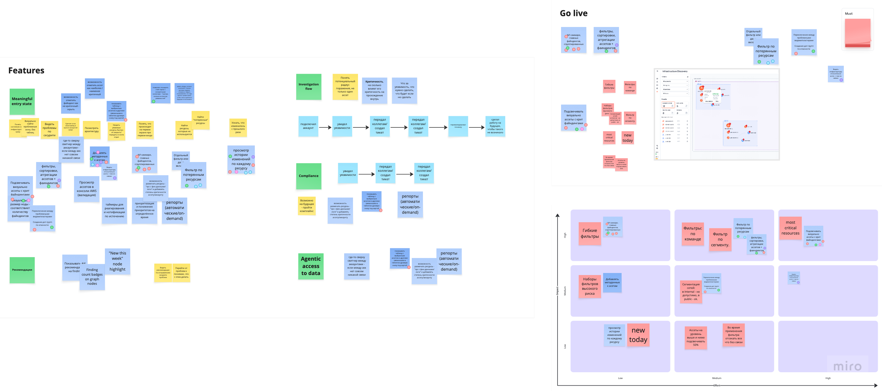
Every idea on the board, ranked by impact against effort
The feedback came in with very little time left to act on it. The job was to pick the few things that mattered most to users and were realistic to build in what was left, and what they asked for lined up with the directions we had already been leaning toward. I ran a couple of sessions with the engineering team: every idea went up on the board, grouped by direction, then ranked by impact against effort. What came out was a short list we could actually ship.
Ideas, grouped and ranked
04 · The design decisions
Three moves turned the inventory map into a triage view
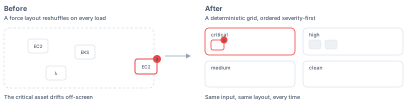
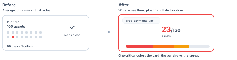
Three moves turned the inventory map into a triage view. Each one was a spec.
Demote the plumbing
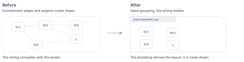
Kill the force simulation
Severity as the visual language
05 · State 2, shipped
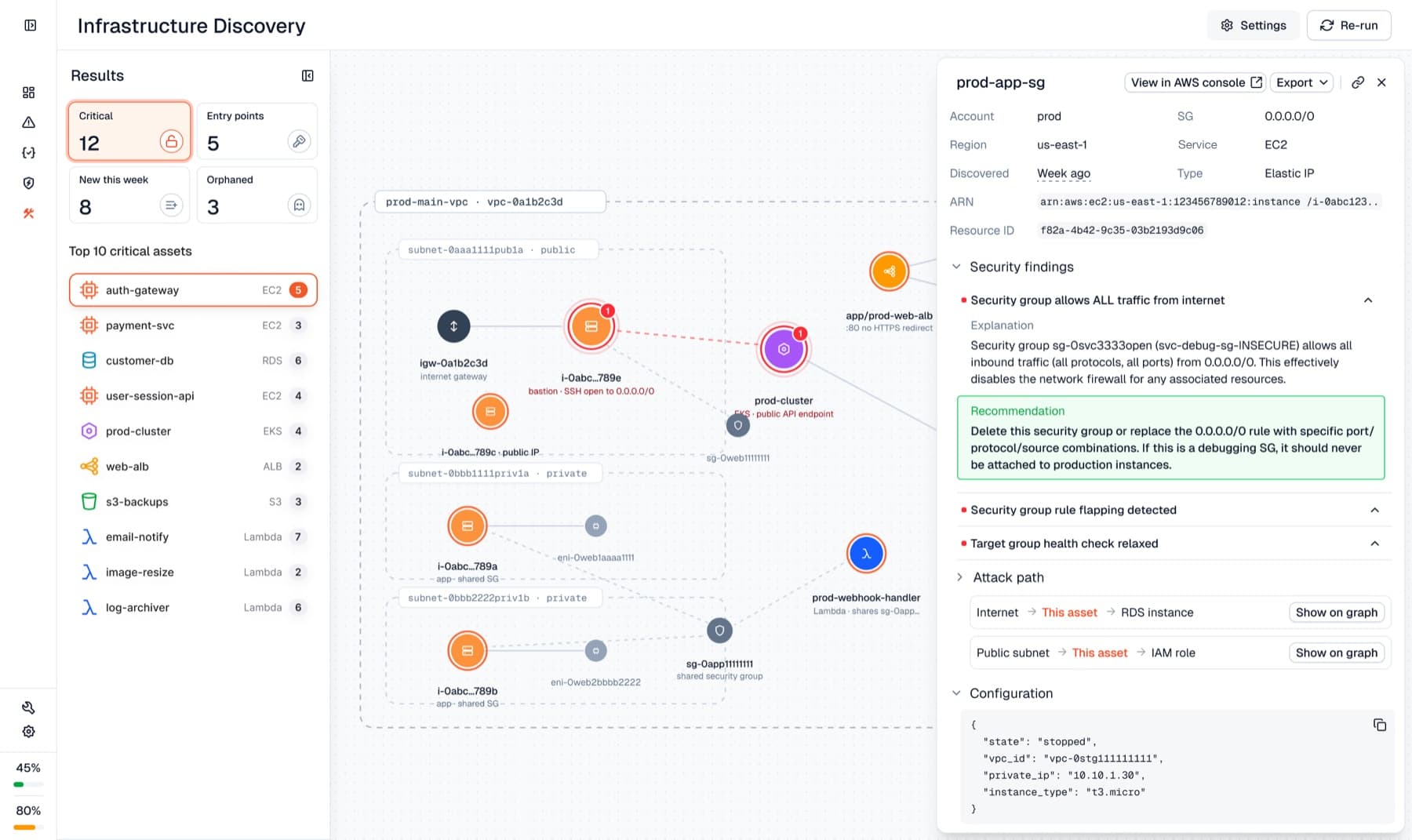
A clustered graph and five views that speak one severity language
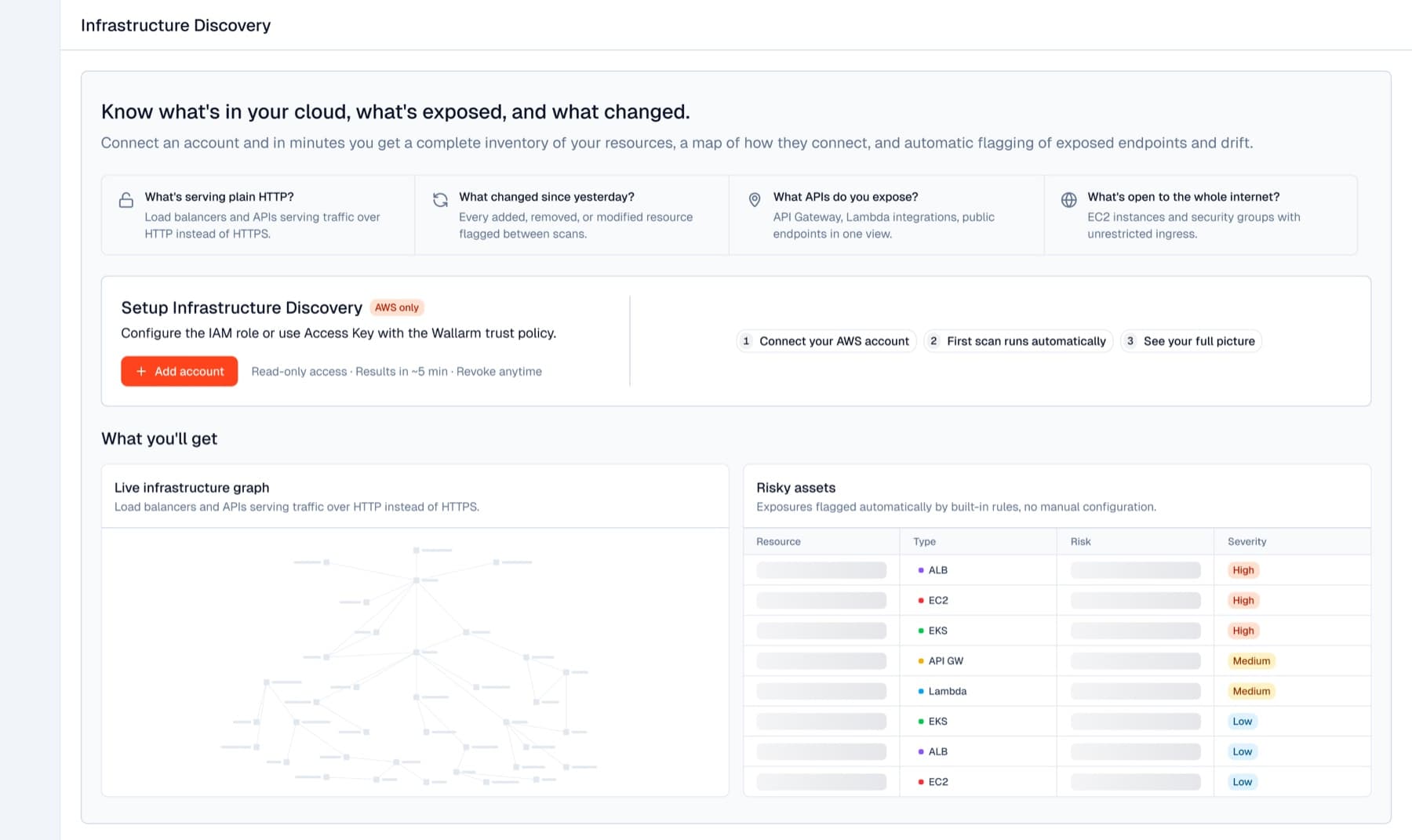
The redesign shipped: a clustered, severity-first graph, five security views that speak one severity language, and a guided onboarding flow, all built on the new design system as it migrated. We showed it at AWS Summit.
06 · How I work with AI
AI does the reading and the grunt work, the judgment stays mine
All of that took six weeks, which is usually the part people ask about. I'm a designer who works in the code, and AI is genuinely how I work here: it does the reading and the grunt work so I can spend my time on design judgment. Engineers owned the backend; I owned the design, and I ran the same loop on every problem.
01
Understand
AI reads the real backend and data and runs fast competitor analysis, so I design against what the product can actually do and how it fits with Wallarm's other products, instead of guessing.
02
Explore
I quickly assemble several directions as working prototypes in code, not flat mockups, so I can get them in front of users and test as early as possible.
03
Spec
I write the decision down: the options, the choice, the risks. The spec is the design artifact.
04
Build
I take the chosen design into the live product myself, working with coding agents, and because our design system is built to be machine-readable, I ship my own updates and new concepts to production.
05
Validate
I put the prototype in front of potential users, running on real seeded data and real topology rather than a happy-path mock, and iterate on their feedback.
06
Ship
The design merges into the live product as merge requests.
My setup: Claude Code with custom skills and subagents, our LLM-adapted design system, all in the product's real React stack.
On this project, that meant: I designed against real data instead of happy-path mocks. I compared more concept directions than a static mockup workflow could. And I shipped my own UI changes as merge requests.
The design system all of this ran on was being rebuilt to be machine-readable at the same time, a parallel track with its own case study →
07 · Impact
Severity now decides where things sit
- The layout stopped contradicting the product: the old simulation spaced assets evenly regardless of severity, so severity now decides where things sit.
- Risk legible at a glance: the product now hands you an answer instead of raw data.
- A strategic reframe delivered to product as a costed, phased proposal.
- Designing against real backend data rather than happy-path mocks, so testing showed real behaviour instead of a clickable illusion.
- AI compressed the delivery: about three weeks to the first working concept, then about three more to the next release. It was shown at AWS Summit, with a base ready for the next round of improvements.
The tool is enterprise B2B, so I have no public adoption numbers to point at. What I can point at is the decision and what it survived: a layout that holds on real customer topology instead of a demo account, and a product that answers what to fix first rather than what exists.
08 · Reflection
The shift from inventory to risk
What I'm proudest of isn't the prettiest screen. It's the shift from inventory to risk, a layout that keeps the dangerous assets in view, and the speed. AI let me take a working concept to user-tested and release-ready quickly, and still lay the groundwork for where the product goes next.
09 · Concept, not shipped
The paths an attacker could actually walk, ranked
From the launch feedback, I explored where the product goes next: an attack-path concept. Instead of showing everything, it surfaces the paths an attacker could actually walk, ranked by what matters. I built it as a clickable prototype, with AI.
Open the prototype full screen →
Building a design system machines can read