
Thomson Reuters
Making security legible across 5000+ applications
PS360, Thomson Reuters' security dashboard, rebuilt around what each role needs to decide
- Industry
- Web security
- Period
- 2 months
- Role
- Lead designer
- Activities
- Heuristic Evaluation, User Interviews, Usability Testing, Dashboard Design
Reading time: 2 min
01 · About
One dashboard for security across 5000+ applications
Thomson Reuters' PS360 dashboard is the central hub for security monitoring across 5000+ applications, consolidating critical information for executives, project managers, and technical teams.
I was the lead designer on this project. I ran the heuristic evaluation, took part in the interview and testing sessions with our researcher, and owned the dashboard design that came out of them.
02 · Challenge
Executives and developers, both underserved by one view
- Lack of personalization: executives couldn't track their OKRs, while developers couldn't prioritize security issues.
- Unclear data visualization that lacked necessary context.
- Poor OKR tracking capabilities for executive users.
- Inefficient information hierarchy making navigation difficult.
03 · Research
A heuristic pass, then interviews across the roles
We conducted a two-phase research study to thoroughly understand user needs.
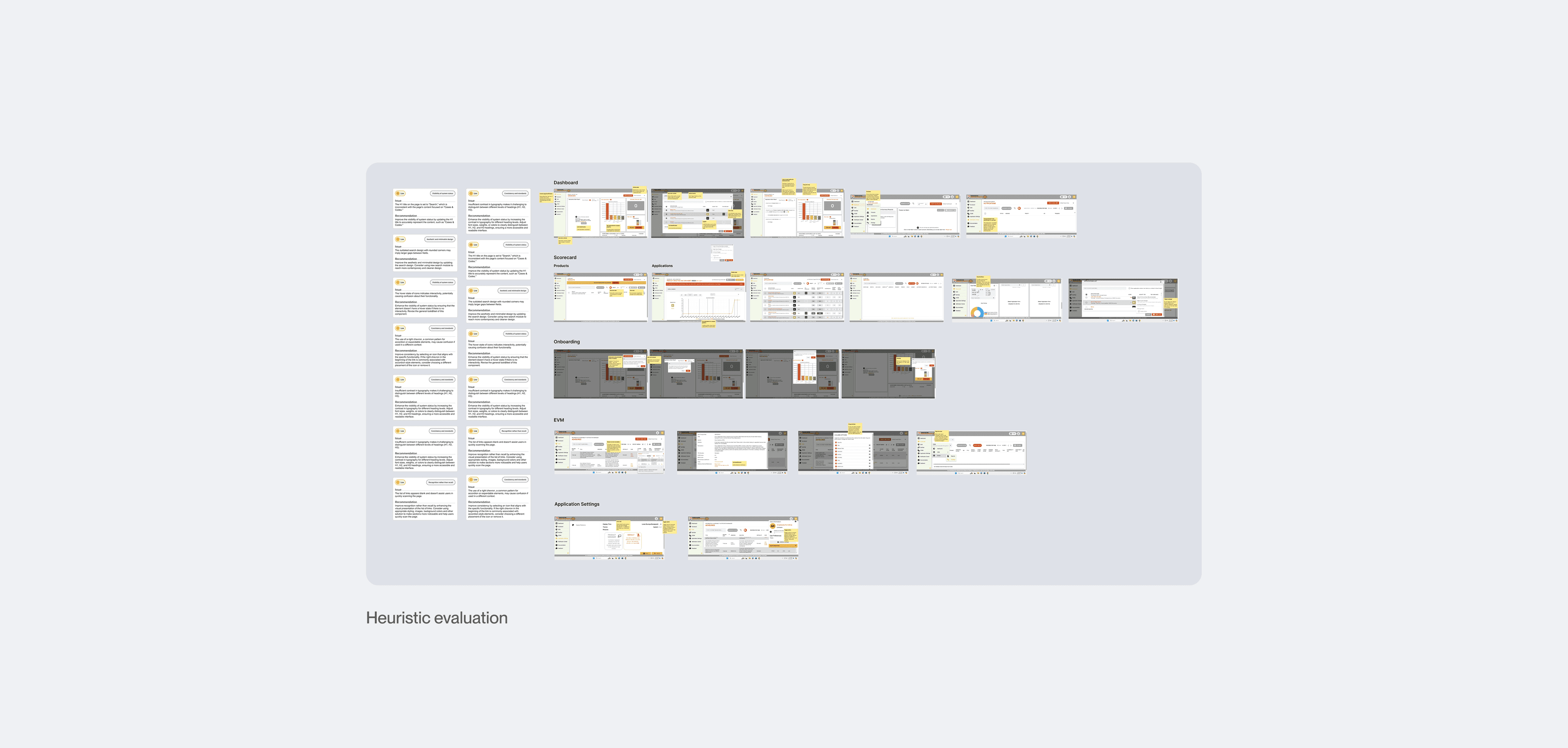
Heuristic Evaluation
We ran an initial heuristic evaluation to collect all possible UX and accessibility issues.
Initial user interviews
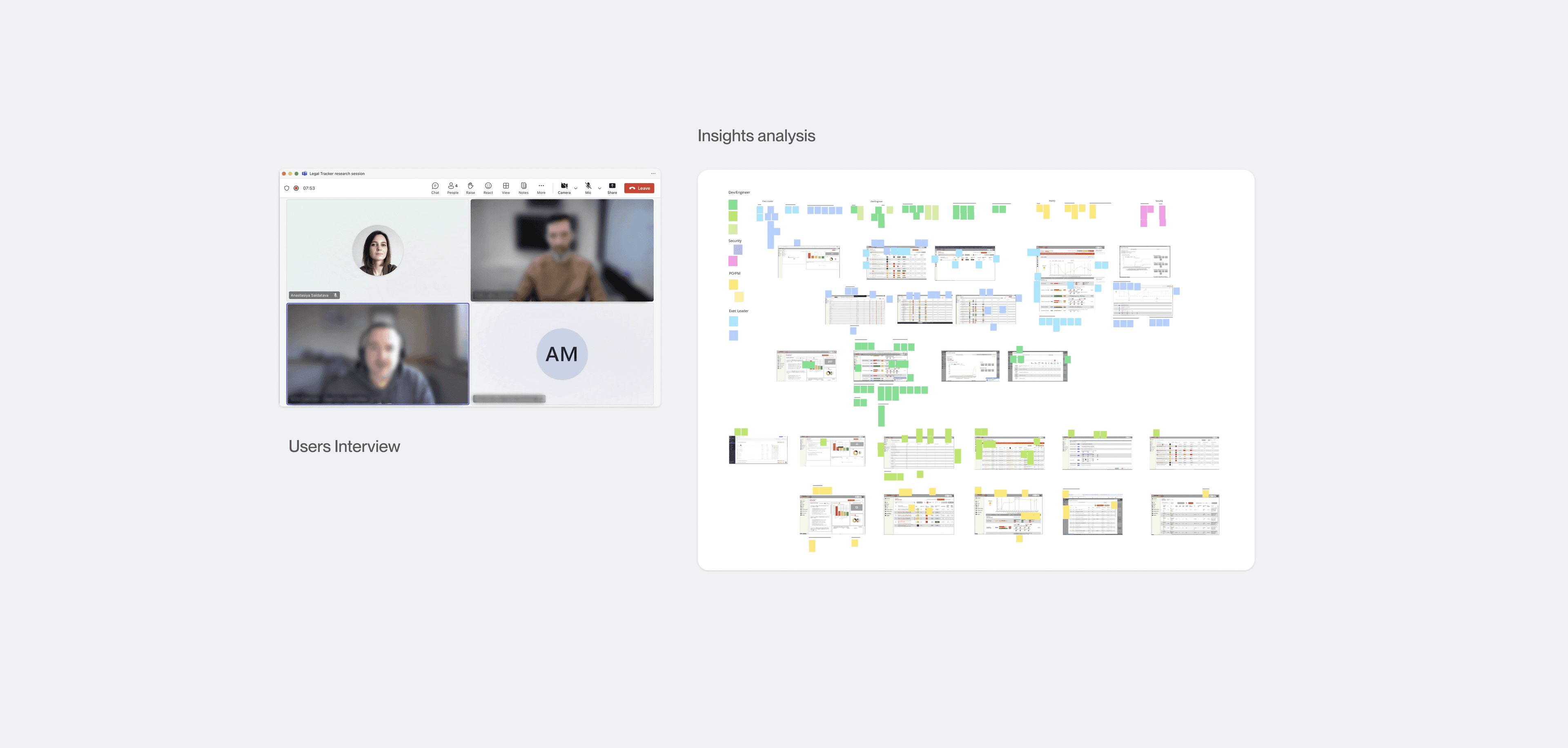
We interviewed users across roles to map how each persona works with PS360 day to day.
12
Sessions
5
Personas
Usability testing
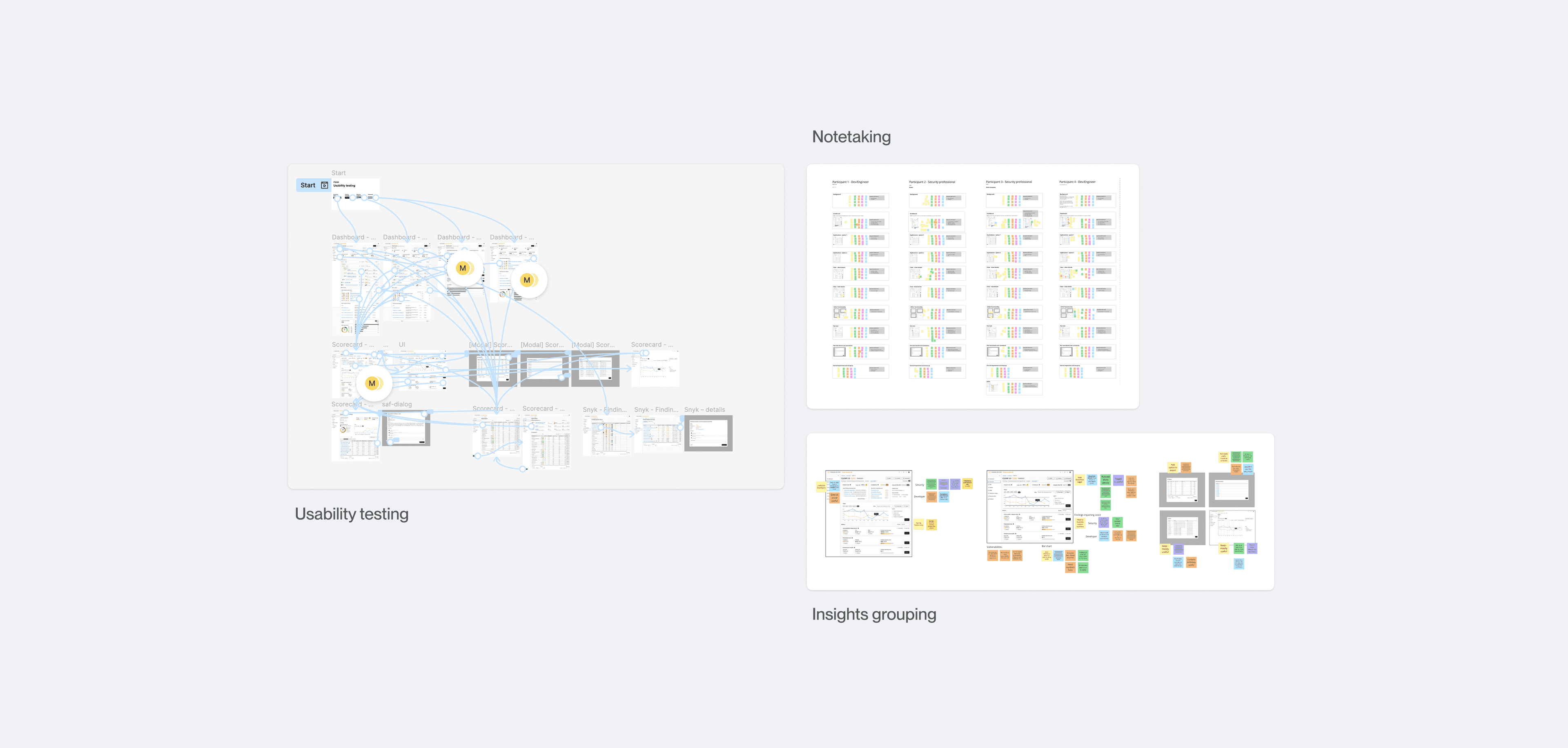
We conducted 10 usability testing sessions focused on validating executive-specific and developer features.
10
Sessions
2
Personas
04 · Critical insights
Different personas, one shared need: context for the numbers
Our research revealed distinct needs across user personas, but also important commonalities.
Executive leaders
- Global view of security status
- OKR tracking capabilities
- Context for performance metrics
Focus on what we built our OKRs around, because then you've got a direct measure.
Developers and security teams
- Detailed technical metrics
- Clear SLA status indicators
- Better organization of vulnerability data
How many vulnerabilities are outside of our SLA for remediation, how many critical are older than 30 days or 60 days?
Common needs across all personas
- Better data context
- Customizable views
- Clear prioritization
If I go here, I would just look at the trend to understand what's going on.
These conversations revealed a common thread: users needed context, not just data.
05 · Solution design
Start broad, drill down: data made hierarchical
Based on our research insights, we developed a solution guided by three core design principles.
Make data hierarchical
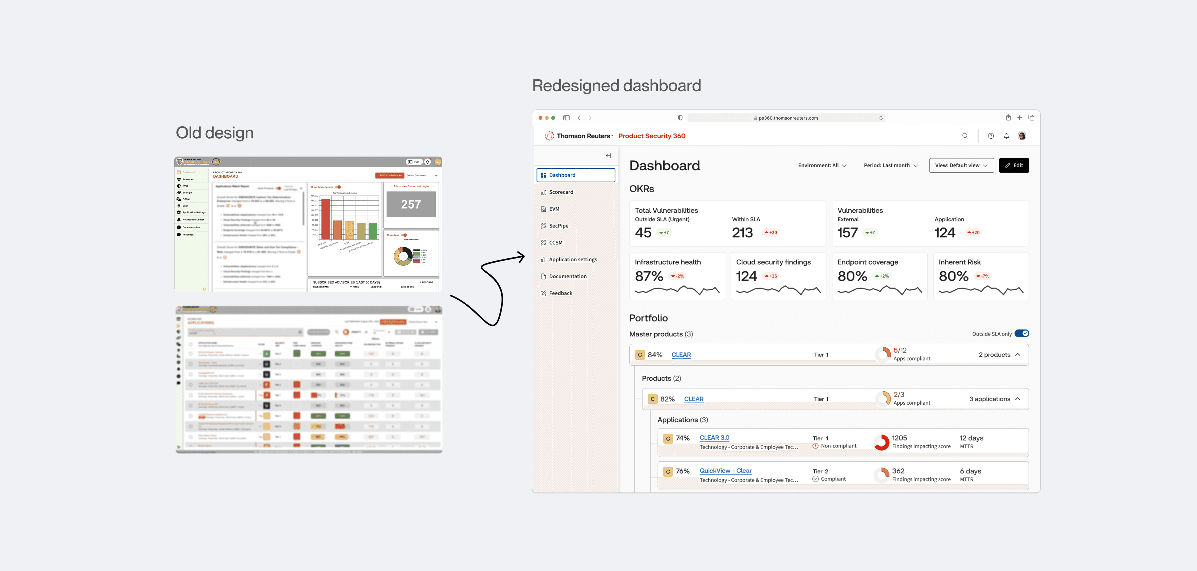
Instead of showing everything at once, we created a system that let users start broad and drill down as needed.
Provide context
We transformed raw numbers into actionable insights. For example, we clearly separated urgent issues from those still within acceptable timeframes rather than just showing vulnerability counts.
Personalize the experience
We designed flexible dashboards that could adapt to different roles while maintaining data consistency.
06 · Results
Urgent separated from acceptable, for each role
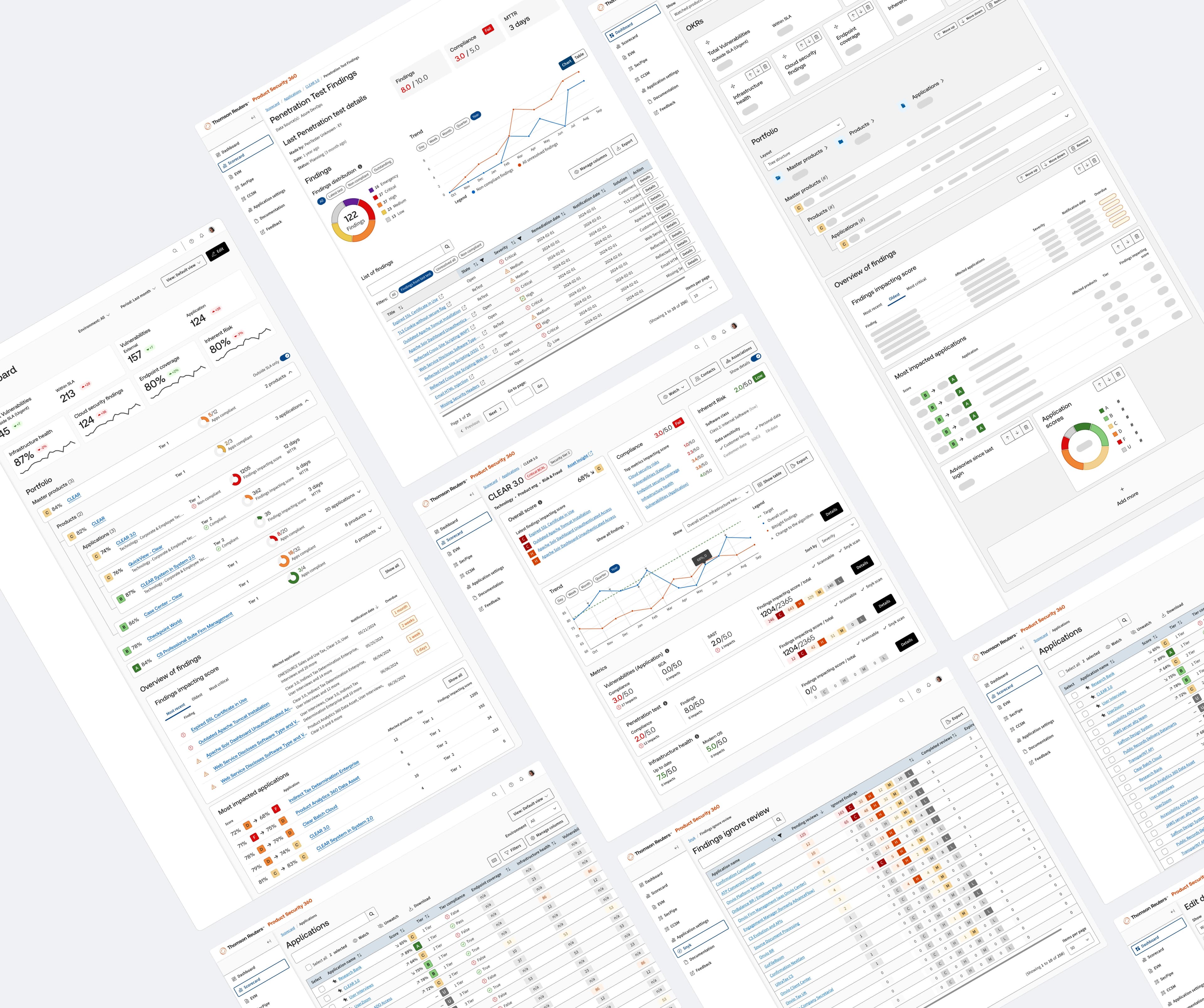
The redesign reorganized the dashboard around the decisions each role has to make. What it changed, in the interface itself:
For the people using it
- Faster decision-making through clearer data presentation
- Improved prioritization with enhanced SLA visualization
- Personalized experience through customizable dashboards
- Better understanding of security metrics with added context
For the organization
- Enhanced security monitoring across 5000+ applications
- More efficient resource allocation through clear prioritization
- Improved compliance tracking with better SLA visibility
- Reduced risk through earlier identification of security issues
07 · Conclusion
Two audiences, one dashboard that answers both
The redesign gave two audiences with different questions, executives tracking OKRs and engineers triaging vulnerabilities, one dashboard that answers both from the same data. The design shipped to development; effects on remediation time were not measured on our side.
Building cloud infrastructure discovery tool